Layout
Layout is a powerfull tool of customizing your store look and feel. You can simply drag-and-drop information blocks to change their position. The Layout grid is based on the Bootsrap 2.3 framework. More information about the Bootstrap framework read at the official Bootstrap site.
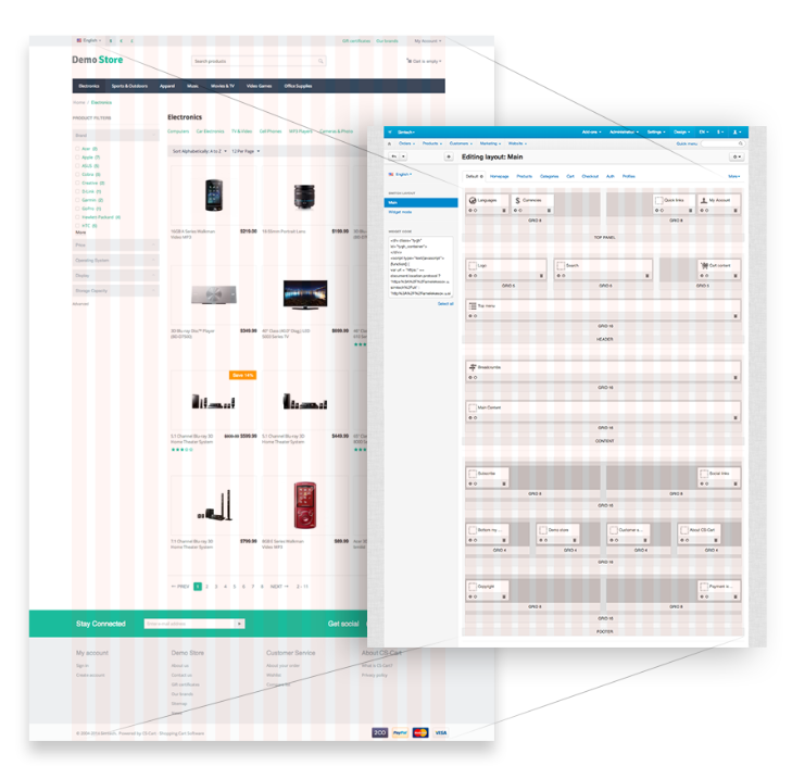
You can manage Layouts in the Design > Layouts section of CS-Cart administration panel.
Layout settings
Layout has the following settings:
- Grid columns - the number of columns in a grid (12 or 16). The 16-column grid is preferable and is used as the default. This grid allows to build more column combinations because the width of each column is smaller, so, totally there are more columns in a grid.
In Bootstrap the 12-column grid is used as default, and there is a big number of templates based on it. You better use this grid if your have the complete layout based on it and you need to move it to CS-Cart.
Important
If you have the 16-column grid and want to change it to 12-column grid, the grid width values will be changed asymetricaly in the administration panel. In the customer area the grid width will not be changed, but the whole site width will be changed instead. You will have to change the grid width value for each greed separately.
- Layout width - choose the Fixed, Fluid, or Full width layout. For the Fluid layout you can define the min and max site width. With the Full width layout the site will be adapted to the full screen width.
With the Fixed layout you can define the column width in pixels (px). One column width and the gutter between them are defined in the css/tygh/grid.less file. They are defined with the LESS variables: @gridColumnWidth and @gridGutterWidth. As default they equal 40px and 20px.
With the following equation (@gridColumns * @gridColumnWidth) + ((@gridGutterWidth * (@gridColumns - 1) it is easy to find out the site max width (1175px by default).
You can also use Media queries to change the blocks width depending on the screen width.
In the Fluid layout the column width is defined in percents (%). One column width and gutter width are defined proportionally according to the values of the variables used for the Fixed layout.
Layout includes
Locations
Location defines the certain page appearance. When adding a location, set:
- Name - location name.
- Dispatch - specific page or page type that the location is associated with. The dispatch parameter has the following format: [controller_name].[mode_name], where [controller_name] - is the name of the controller, and [mode_name] - is the mode in which the controller works. This value is added to index.php?dispatch= part of the page and points to a specific location. For example, index.php?dispatch=checkout.cart points to the cart contents page while index.php?dispatch=checkout.checkout points to the checkout page. You can choose the predefined values from the drop-down list.
Such site elements as header and footer are usually identical for every page. Not to duplicate this content for each page, use the Default location.
Default location is not attached to some page but defines the common locations appearance. Default location must be always defined. To make a location default, choose the Default checkbox in the location settings.
Containers
Location layout consists of 4 containers: top panel, header, content, and footer.
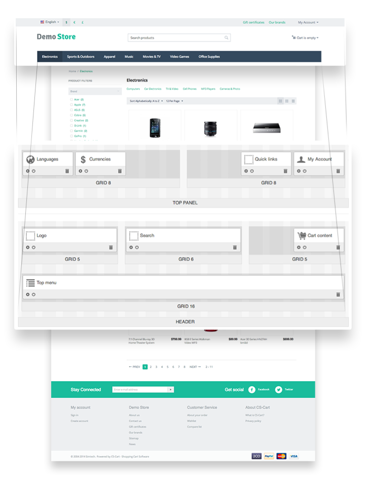
The top panel, header, and footer containers are defined only for the Default location.
In bootstrap containers have the following structure:
For the Fixed layout:
<div class="container">...</div>
For the Fluid layout:
<div class="container-fluid">...</div>
Grids
Grids are placed in containers. In Bootstrap grid includes .span and .row. As the default, the 16-column grid is used in CS-Cart.
You can define the following parameters for a grid:
- Width - number of columns used in the container. For child containers, this number cannot exceed the the length of the root container. This setting defines .span to be used for a block (.span1-.span16).
- Content alignment - container position inside the root (or parent) container: Right, Left or Full Length. Adds the
ty-float-leftclass for the left alignment and thety-float-rightclass for the right alignment. - Offset - adds the block shift from the left side. Uses the same values as .span. The
.offsetclass is added for grid. - User-defined CSS-class - used to add a CSS-class.
Blocks
Block is a separate box which represents a particular storefront component. Blocks are added in grids.
They are created based on schemas. Schema is a file where all blocks, their settings and templates are defined. The path to the blocks schema file: app/schemas/block_manager/blocks.php
Block settings:
- Name - block name.
- Template - template (.tpl) defined for a block. Block templates are stored in the templates/blocks/ directory.
- Wrapper - template to include content. Wrappers are stored in the /templates/blocks/wrappers/ directory.
- User-defined CSS-class - used to add a CSS-class.
Hint
If you need to place a block in the top panel, header, or footer (containers that are used only in the Default location) for a certain page, use the HTML block with Smarty support. In this block use the $runtime.controller and $runtime.mode variables to define the current page.
Example:
To display some text in the header of the Categories page:
- Create the HTML block with Smarty support block in the header container.
- In the block write the following code:
{if $runtime.controller == "categories" && $runtime.mode == "view"}
        <p>Categories page</p>
{/if}
Layout Export/Import
You can export the created layout to a file of import previously created layout.
To do it, in the Design > Layouts section of the administration panel click the gear button in the right upper corner of the page and choose the desired action.
When creating the new theme, export layout to the layouts directory after adjusting blocks (remove the old files previously). This layout will be authomatacally enabled when installing a theme.
Export/Import file includes:
- Layout settings.
- Containers, grids, and blocks structure and settings.
- Blocks content. It is defined in the Content tab and depents on the block type.
For example, for the HTML block and HTML block with Smarty support blocks it is text included in the text area. In the block of the Products type the criteria of products display (newest, recently viewed) and their settings are defined. But not all the blocks have content.
Warning
Layout is installed only when you install a theme. If you install a theme and then switch to another one, the Layout of the latest installed theme will be active.
Questions & Feedback
Have any questions that weren't answered here? Need help with solving a problem in your online store? Want to report a bug in our software? Find out how to contact us.