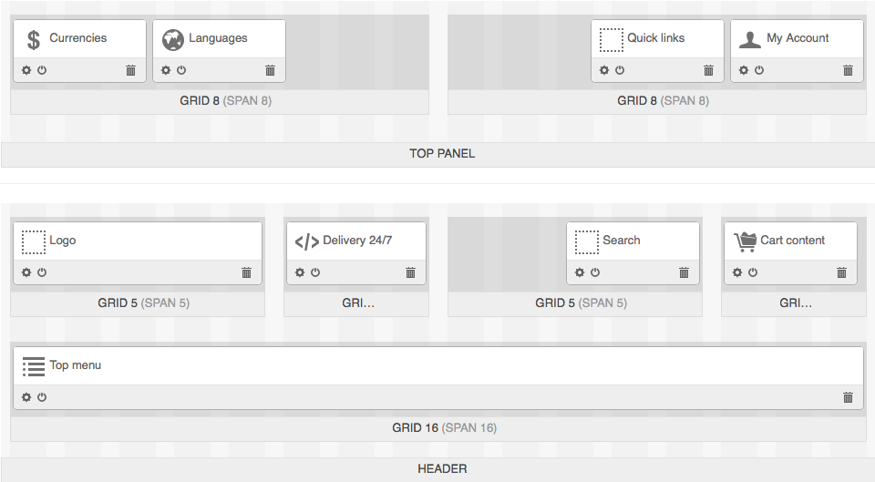
Editing blocks
Lets replace the Currencies and Languages blocks as it is done in the example. To do it, just drag-and-drop the Languages block to the Currencies block place.
Also, we will add the Delivery 24/7 block. To do it, we will add a new grid for the block. To add a new grid to a particular place we will have to reorganize grids in the Header container first:
Move the grid with the Top menu block:
- Hover the mouse pointer over the Header container and click the + button. Click Add grid.
- In the opened window choose 16 in the Width select box, type top-menu-grid in the User-defined CSS-class field, and click Create.
- Drag-and-drop the Top menu block to the newly created grid.
Now we have one empty 16-column grid from where we have just moved the Top menu block.
- Click the gear icon of this 16-column grid.
- In the opened window choose 3 in the Width select box and type cart-content-grid in the User-defined CSS-class field. Click Save.
- Drag-and-drop the Cart content block to this grid.
- In the vacant grid click the gear icon.
- In the opened window choose 5 in the Width select box and replace cart-content-grid with search-block-grid in the User-defined CSS-class field. Click Save.
- Drag-and-drop the Search block to this grid.
Now we have one empty 3-column grid in the Header container. To create the Delivery 24/7 block:
- Click the gear icon of the empty 3-column grid. Clear the User-defined CSS-class field and click Save.
- Click the + icon of this grid and choose Add block.
- In the opened window switch to the Create new block tab and click the HTML block button.
- In the Name field type Delivery 24/7 and switch to the Content tab.
- In the Content field settings click the </> button and copy the following code to the field:
<div class="ty-delivery">
  <i class="ty-delivery__icon"></i> Delivery 24/7
</div>
Leave rest of the blocks as they are.
There is no the My account block in the example, but as it is the important functionality, we will keep it.
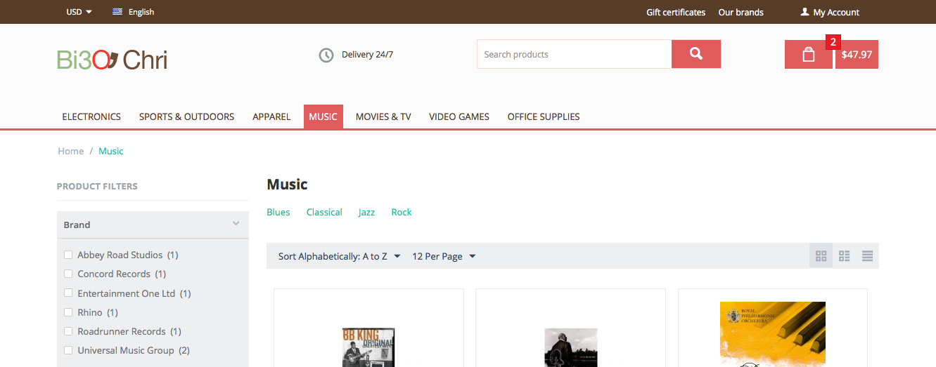
That is what we have as the result:
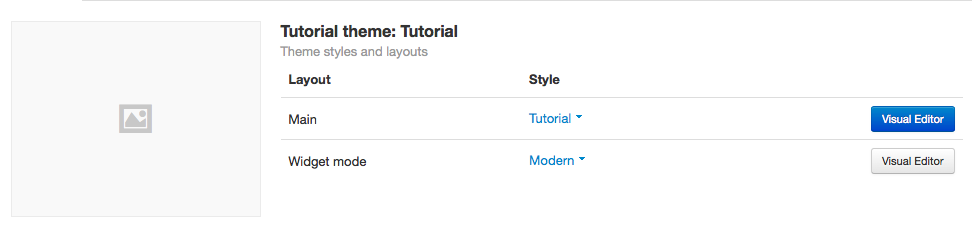
Creating styles for Top panel and Header
In CS-Cart it is posible to change the container backgrounds, links and text color with the Theme Editor.
To open the Theme Editor, in the administration panel go to Design → Themes and click the Theme Editor button of the Main layout.
Note
Before version 4.3.6 the button was called Visual Editor.
To change the Top panel background:
- In the left panel of the Theme Editor find the Customize section. Choose Backgrounds from the drop-down menu.
- Find the Top panel section and click on the Background color field.
In the right lower corner of the opened panel there is an input field for defining color manually. Type #573c27 there to define color as in the example.
It is also possible to define gradient for background. Click the gear icon near the Background color field. The drop down panel with the additional settings will be opened.
Here you can pick the second color for gradient, choose whether the Top panel will be transparent and occupy the full width of a page.
- Define the Header background color in the same manner. In the example this color is #fbfbfb. Switch on the Full width setting for this section.
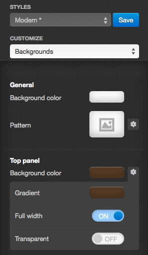
- When all changes are applied click the Save button. In the opened window define the name of your style and click OK.
Adding custom CSS styles
Open the themes/tutorial/css/ directory of your CS-Cart installation and create the custom.less file there. Include it to the themes/tutorial/templates/common/styles.tpl file.
We will add our custom styles for the Currencies, Languages, Delivery 24/7, Cart content, and other sections of the customer area to the custom.less file.
Currencies
By default 3 currencies are displayed in a line. When the screen is small the drop-down list appears.
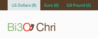
To display the drop-down list by default:
- Go to the Design → Layouts section and find the Currencies block.
- Click the gear icon of this block and switch to the Block settings tab.
- Type 1 in the Minimal number if items to be placed in a dropdown list input field and click Save.
You can define the currency name and symbol in the Administration → Currencies section of the administration panel.
As we can see in the example, the currency symbol is not in use. So, we will remove it from a template.
There are 2 ways to find a template where the currency symbol is defined:
- Searching by files of classes that are used in the layout.
You can find out what classes are used with the help of DevTools for Chrome or Firebug for Firefox.
Note
CSS styles are saved is cache. To clear cache automatically, enable the Rebuild cache automatically setting on the Design → Themes page in the administration panel.
Search by the ty-select-block__a-item class that is used in the templates/common/select_object.tpl file.
The following code controls the currency icon displaying:
{if $items.$selected_id.symbol} ({$items.$selected_id.symbol nofilter}){/if}
Remove it from the template and save the file.
- Using the template include hierarchy.
Templates for layouts are stored in templates/blocks. For the Currencies block the currencies.tpl template is used.
Including template is defined in the app/schemas/block_manager/blocks.php scheme.
'currencies' => array(
'content' => array (
        'currencies' => array (
        'type' => 'function',
        'function' => array('fn_block_manager_get_currencies'),
        ),
),

...

'templates' => 'blocks/currencies.tpl',
'wrappers' => 'blocks/wrappers',
),
The following code controls displaying currencies in a drop-down list:
<div class="ty-select-wrapper">{include file="common/select_object.tpl" style="graphic" suffix="currency" link_tpl=$config.current_url|fn_link_attach:"currency=" items=$currencies selected_id=$secondary_currency display_icons=false key_name=$key_name}</div>
In this code the common/select_object.tpl file is added with the help of include. This is the file where the currency icon is defined.
Now we will add styles.
All links in the Top panel are white. So, lets add the following styles for them:
.top-grid a {
color: #fff;
}
top-grid - the custom class for the grid that can be changed in grid settings.
Custom classes for blocks and grids do not have the ty- prefix in their names. This helps not to mix them with classes in templates.
Currency text letters in the example are uppercase. Adding the style only for ty-select-block__a-item is not correct as it is used for displaying languages too.
It is better to use a block class where ty-select-block__a-item is placed in a selector:
.top-currencies .ty-select-block__a-item {
text-transform: uppercase;
}
Languages
To remove an arrow near the language name, hide it in the CSS file:
.top-languages .ty-select-block__arrow {
display: none;
}
Add styles for Quick links:
.top-quick-links .ty-text-links__a {
font-size: 12px;
}
Delivery 24/7
First of all, we will add an icon for this block. For this purpose we will use icon fonts and the icomoon.io service.
We will take the clock icon from the set of free IcoMoon icons.
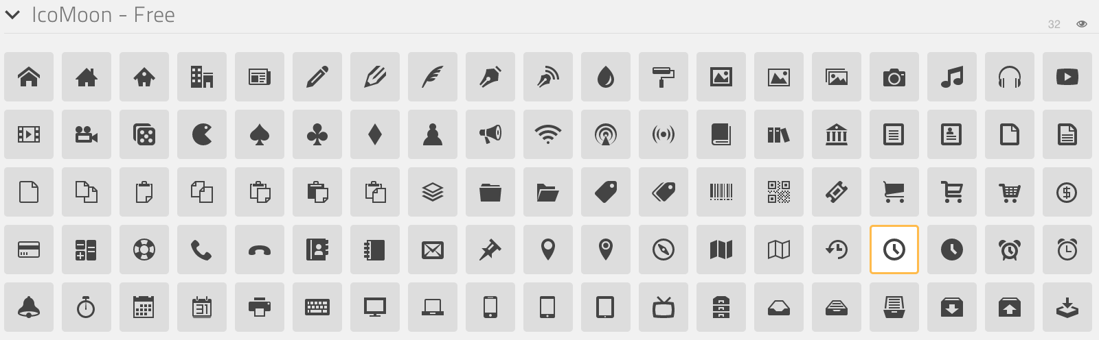
Save the font in the media/fonts/ directory of the Tutorial theme theme.
Move icon styles from the style.css file to custom.less file and update paths to the fonts.
@font-face {
font-family: 'tutorial';
src:url('../media/fonts/tutorial.eot?-vagbvx');
src:url('../media/fonts/tutorial.eot?#iefix-vagbvx') format('embedded-opentype'),
        url('../media/fonts/tutorial.woff?-vagbvx') format('woff'),
        url('../media/fonts/tutorial.ttf?-vagbvx') format('truetype'),
        url('../media/fonts/tutorial.svg?-vagbvx#tutorial') format('svg');
font-weight: normal;
font-style: normal;
}

[class^="tt-icon-"], [class*=" tt-icon-"] {
font-family: 'tutorial';
speak: none;
font-style: normal;
font-weight: normal;
font-variant: normal;
text-transform: none;
line-height: 1;

/* Better Font Rendering =========== */
-webkit-font-smoothing: antialiased;
-moz-osx-font-smoothing: grayscale;
}
.tt-icon-clock:before {
content: "\e601";
}
Note
When creating a new icon font, pay attention that the icon classes names must not match the names of icon classes in a template. So, do not use the ty-icon- prefix.
Add the tt-icon-clock class for ty-delivery__icon of the Delivery 24/7 block.
Add styles:
/* Delivery
========================================================================== */
.ty-delivery {
color: #573c27;
font-size: 12px;
}
.ty-delivery__icon {
color: #8f979a;
font-size: 21px;
vertical-align: middle;
margin-right: 8px;
}
Add styles for the search field. We will not change the layout, just styles:
/* Search form
========================================================================== */
input.ty-search-block__input {
border-color: #fad8d3;
color: #979595;
font-size: 12px;
padding-right: 80px;
}
.ty-search-magnifier {
height: auto;
background: #e05b5b;
color: #fff;
top: 1px;
right: -1px;
width: 70px;
bottom: 1px;
font-size: 22px;
}
Add styles for the Main menu:
/* Main menu
========================================================================== */
.ty-menu__items {
    background: none;
}
.ty-menu__item .ty-menu__item-link {
    padding: 8px 8px;
    color: #573c27;
    text-transform: uppercase;
    font-size: 13px;
    min-height: 0;
    margin-right: 10px;
}
.no-touch .ty-menu__item:hover .ty-menu__item-link,
.is-hover-menu .ty-menu__item-link,
.is-hover-menu.ty-menu__item-active .ty-menu__item-link {
    background: #e05b5b;
}
.ty-menu__submenu-items {
    margin-top: 3px;
    border-color: #e05b5b;
}
Cart content
The templates/blocks/cart_content.tpl template is used for this block.
The following code controls the cart content displaying:
<div id="sw_dropdown_{$dropdown_id}" class="ty-dropdown-box__title cm-combination">
<a href="{"checkout.cart"|fn_url}">
{hook name="checkout:dropdown_title"}
{if $smarty.session.cart.amount}
<i class="ty-minicart__icon ty-icon-basket filled"></i>
<span class="ty-minicart-title ty-hand">{$smarty.session.cart.amount} {__("items")} {__("for")} {include file="common/price.tpl" value=$smarty.session.cart.display_subtotal}</span>
<i class="ty-icon-down-micro"></i>
{else}
<i class="ty-minicart__icon ty-icon-basket empty"></i>
<span class="ty-minicart-title empty-cart ty-hand">{__("cart_is_empty")}</span>
<i class="ty-icon-down-micro"></i>
{/if}
{/hook}
</a>
</div>
Replace the layout with the following:
<div id="sw_dropdown_{$dropdown_id}" class="ty-dropdown-box__title cm-combination">
    <a href="{"checkout.cart"|fn_url}">
        {hook name="checkout:dropdown_title"}
            {if $smarty.session.cart.amount}
                <span class="ty-minicart-title"><i class="tt-icon-bag"></i><span class="ty-minicart-title__amount">{$smarty.session.cart.amount}</span></span>
                <span class="ty-minicart-title__price">{include file="common/price.tpl" value=$smarty.session.cart.display_subtotal}</span>
            {else}
                <span class="ty-minicart-title empty-cart"><i class="tt-icon-bag"></i></span>
            {/if}
        {/hook}
    </a>
</div>
Add the layout for a cart:
/* Cart content
   ========================================================================== */
.ty-minicart-title {
    padding: 5px 23px;
    background: #e05b5b;
    color: #fff;
    font-size: 22px;
    vertical-align: top;
    position: relative;
}
.ty-minicart-title__amount {
    position: absolute;
    position: top;
    top: -8px;
    right: -12px;
    font-size: 14px;
    color: #fff;
    background: #ed1c24;
    padding: 0 6px;
    border: 1px solid rgba(85, 32, 32, 0.4);
}
.ty-minicart-title__price {
    display: inline-block;
    vertical-align: top;
    padding: 11px 9px 10px;
    background: #e05b5b;
    color: #fff;
    font-size: 14px;
}
.top-cart-content .ty-dropdown-box__title {
    padding: 0;
}
Finally, add the correct indentations and styles for elements when hovering on them.
This is the resulting custom.less file for Top panel and Header:
@font-face {
    font-weight: normal;
    font-style: normal;
    font-family: 'tutorial';
    src:url('../media/fonts/tutorial.eot?-vagbvx');
    src:url('../media/fonts/tutorial.eot?#iefix-vagbvx') format('embedded-opentype'),
        url('../media/fonts/tutorial.woff?-vagbvx') format('woff'),
        url('../media/fonts/tutorial.ttf?-vagbvx') format('truetype'),
        url('../media/fonts/tutorial.svg?-vagbvx#tutorial') format('svg');
}

[class^="tt-icon-"], [class*=" tt-icon-"] {
    text-transform: none;
    font-weight: normal;
    font-style: normal;
    font-variant: normal;
    font-family: 'tutorial';
    line-height: 1;
    speak: none;

    /* Better Font Rendering =========== */
    -webkit-font-smoothing: antialiased;
    -moz-osx-font-smoothing: grayscale;
}

.tt-icon-bag:before {
    content: "\e600";
}
.tt-icon-clock:before {
    content: "\e601";
}

.top-grid a {
    color: #fff;
}
.top-grid .ty-select-block__a:hover,
.top-grid .ty-select-block__a.open {
    background: none;
    color: #fff;
}

.ty-select-block__a-item {
    font-size: 11px;
}

.top-currencies .ty-select-block__a-item {
    text-transform: uppercase;
}
.top-currencies .ty-select-block__arrow {
    color: #fff;
}

.top-languages .ty-select-block__arrow {
    display: none;
}


.top-quick-links .ty-text-links__a {
    font-size: 12px;
}


div.header-grid {
    padding-top: 22px;
}


/* Delivery
   ========================================================================== */
.ty-logo-container {
    margin-top: 15px;
}


/* Delivery
   ========================================================================== */
.ty-delivery {
    margin-top: 12px;
    color: #573c27;
    font-size: 12px;
}
.ty-delivery__icon {
    margin-right: 8px;
    color: #8f979a;
    vertical-align: middle;
    font-size: 21px;
}

/* Search form
   ========================================================================== */
input.ty-search-block__input {
    padding-right: 80px;
    border-color: #fad8d3;
    color: #979595;
    font-size: 12px;
    height: 42px;
}
.ty-search-magnifier {
    top: 1px;
    right: 1px;
    bottom: 1px;
    width: 70px;
    height: auto;
    background: #e05b5b;
    color: #fff;
    font-size: 22px;
}

.tygh-header {
    border-bottom: 3px solid #e05b5b;
}

/* Main menu
   ========================================================================== */
.top-menu-grid {
    padding-top: 50px;
}
.ty-menu__items {
    background: none;
}
.ty-menu__item .ty-menu__item-link {
    padding: 8px 8px;
    color: #573c27;
    text-transform: uppercase;
    font-size: 13px;
    min-height: 0;
    margin-right: 10px;
}
.no-touch .ty-menu__item:hover .ty-menu__item-link,
.is-hover-menu .ty-menu__item-link,
.is-hover-menu.ty-menu__item-active .ty-menu__item-link,
.ty-menu__item.ty-menu__item-active .ty-menu__item-link {
    background: #e05b5b;
    color: #fff;
}
.ty-menu__submenu-items {
    margin-top: 3px;
    border-color: #e05b5b;
}

/* Cart content
   ========================================================================== */
.ty-minicart-title {
    padding: 5px 23px;
    background: #e05b5b;
    color: #fff;
    font-size: 22px;
    vertical-align: top;
    position: relative;
}
.ty-minicart-title__amount {
    position: absolute;
    position: top;
    top: -8px;
    right: -12px;
    font-size: 14px;
    color: #fff;
    background: #ed1c24;
    padding: 0 6px;
    border: 1px solid rgba(85, 32, 32, 0.4);
}
.ty-minicart-title__price {
    display: inline-block;
    vertical-align: top;
    padding: 11px 9px 10px;
    background: #e05b5b;
    color: #fff;
    font-size: 14px;
}
.top-cart-content .ty-dropdown-box__title {
    padding: 0;
}

/* Account
   ========================================================================== */
.ty-account-info__title {
    font-size: 12px;
}
.ty-account-info__user-arrow {
    visibility: hidden;
}
.ty-dropdown-box__title:hover,
.ty-dropdown-box__title.open {
    background: none;
}