Styles and Theme Editor
Theme Editor
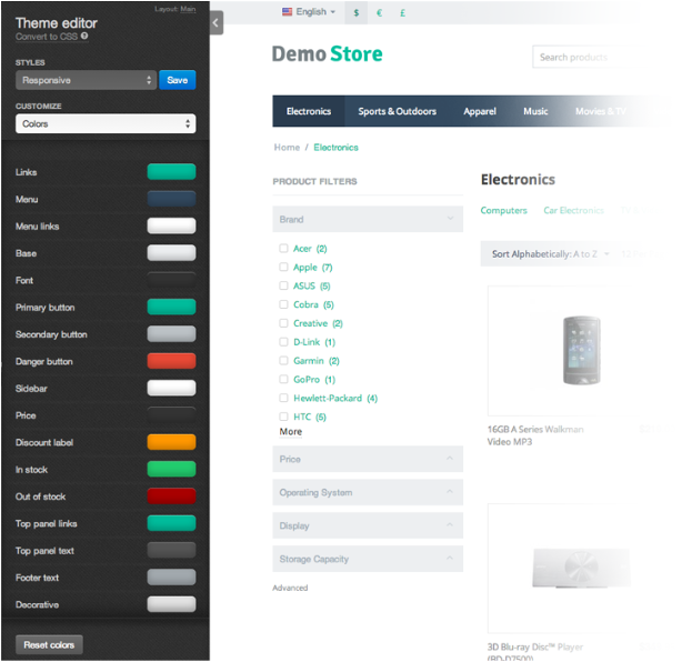
CS-Cart Theme Editor is a helpful tool for editing store appearance that has a very simple and user-friendly interface.
For example, if you want to change the background or buttons color, there is no need to edit CSS. You can just open Theme Editor and choose the desired color for corresponding element.
Depending on the developer, theme in CS-Cart may contain Theme Editor or not. But customers will definitely be very glad to have such a powerful tool as the Theme Editor in their supply. It is much better that editing CSS manually.
To open the Theme Editor in the administration panel go to the Design → Themes section and click the Theme Editor button.
Note
Before version 4.3.6 the button was called Visual Editor.
Styles
There is a set of pre-installed Styles in the Theme Editor for each theme.
For example, if you have the my_theme theme, you can create different styles for its appearance. For Halloween you may paint your store in dark colors and name this style Halloween. And in the right day all you will need to do - just pick this style from the list.
All Styles created with the Theme Editor are stored in the following directory: design/themes/[your_theme_name]/styles/.
The styles directory includes 1 directory and 2 files.
The data/ directory contains .less, .css, and .png files. In these files the edited data and user’s styles are stored.
Important
Starting with version 4.3.7, the styles directory isn’t required. You’ll need it only if you want your theme to support the Theme Editor and multiple styles.
If the theme’s directory doesn’t have the styles directory in it, the Theme Editor won’t work for the theme. When you go to Design → Themes, the Theme editor button will be grayed out, and if you hover over it, you’ll see the following tooltip: “This theme doesn’t support theme editor.”
Manifest.json
The manifest.json file contains data about styles in the json format.
default_style- the default style.names- styles names. For example, you have created a style with the example_style name and want to rename it to Cool Style, than you have to add the following key-value pair:"names": { "example_style": "Cool Style" }
default- default styles (it will be impossible to remove them with the Theme Editor).
schema.json
The schema.json file contains all available fields for editing in the Theme Editor in the json format. With this file you can add custom fields for editing.
schema.json is divided into 4 parts:
general- contains the General section settings:fields- a list of fields available for editing.variable_name- name of a variable that will be available in the less file. You can define any name.description- field description (the language variable name).type- field type (checkbox, for example).true- values that checkbox can take when enabled.false- values that checkbox can take when disabled.
colors- contains the Colors section settings:fields- a list of fields available for editing.variable_name- name of a variable that will be available in the less file. You can define any name.description- field description (the language variable name).
fonts- contains the Fonts section settings:families- a list of fonts available by default (system fonts).fields- a list of fields available for editing.variable_name- name of a variable that will be available in the less file.description- field description (the language variable name).properties- fonts settings, for example, variants of size.size- font size settings.match- name of the variable where the chosen value will be saved. This variable will be available in the less file.unit- font size value unit: px, em, %, etc.values- array with the available size values. [8,9,10,11] means that it is possible to choose among 4 available sizes.
style- font style settings (bold or italic, for example).U- setting name will be displayed in the Theme Editor (U- underlined,B- bold, andI- italic).match- name of the variable where the chosen value will be saved. This variable will be available in the less file.property- property value (Ufor underlined).default- default value.
backgrounds- contains the Backgrounds section settings:fields- a list of fields available for editing.variable_name- name of the variable that will be available in the less file.description- field description (the language variable name).properties- background properties settings.color- background color settings.match- name of the variable where the chosen value will be saved.
pattern- if value is a string, it is possible to use an image as the background. String is used as a variable name.position- background position. Can be: top, right, left, bottom. String is used as a variable name.repeat- defines the method of the background image repeat. Can be: repeat, no-repeat, repeat-x, repeat-y. String is used as a variable name.attachment- defines whether the background image will be scrolled together with contents. String is used as a variable name.
full_width- defines whether the background image will be spread to the full content width or just to the container.description- field description (the language variable name).type- field type (checkbox in this case).true- values that checkbox can take when enabled.false- values that checkbox can take when disabled.
transparent- defines whether the background will be transparent.match- name of the variable where the chosen value will be saved.
gradient- defines whether the background will be gradient. The value from the color section is used as the first color.match- name of the variable where the chosen value will be saved.
Example
To add the custom field with the my_custom_field_name name to the Colors section of the Theme Editor:
In the schema.json file find the colors section and add the following code to the end:
------------------------------------------------------------------------
"my_custom_field_name": {
     "description": "theme_editor.my_custom_field_color"
}
------------------------------------------------------------------------
my_custom_field_name - name of the variable that will be available in the less files.
description - field description (the language variable name).
After that you can use the @my_custom_field_name variable in your less files. More information about the less variables you can read here.
Example of the code in the less files:
.my_class {
color: @my_custom_field_name;
}
Questions & Feedback
Have any questions that weren't answered here? Need help with solving a problem in your online store? Want to report a bug in our software? Find out how to contact us.