Pages
Page Types
Use the Website → Pages section to create and publish new content of the following type:
- Page—a simple page that can only contain a text formatted in HTML. Good for various descriptions and policies.
- Form—a page that contains a contact form and optionally a text formatted in HTML. Forms are built with a user-friendly form builder that doesn’t require any HTML knowledge.
Important
Enable and configure the Form Builder add-on under Add-ons → Manage add-ons to be able to create and edit forms.
- Poll (requires a CS-Cart/Multi-Vendor license)—a survey or a questionnaire.
Important
Enable and configure the Polls add-on under Add-ons → Manage add-ons to be able to create surveys in your store.
- Link—a reference to an external web resource or any page of your web site.
Page Attributes
General
- Parent page—the page that will contain a simple text link to this page. The parent page can be of any page type. If the page shouldn’t have a parent page, select - Root level page -.
- Name—the name of the page as it appears on the storefront.
- Store—the store where the page will appear.
Note
The Store field won’t appear if you have only one storefront.
- Description—the plain text or the text formatted in HTML, that will appear on the page.
Hint
If you are not familiar with HTML, use the built-in WYSIWYG editor to format the text.
- Status—the status of the page.
- Active—the page appears on the storefront.
- Disabled—the page doesn’t appear on the storefront, and can only be edited in the admininstration panel.
- Hidden—the storefront has no link to the page, but the page is available via a direct link.
- Page title—the title of the page, which is displayed in the title bar of the web browser. Required for SEO purposes.
- META description—the content of the HTML meta tag describing the page. Required for SEO purposes.
- META keywords—the content of the HTML tag with the list of search keywords for the page. Required for SEO purposes.
- User groups (requires a CS-Cart/Multi-Vendor license)—the user groups, members of which can access the page.
- Creation date—the date when the page was created.
- Use available period—enable this option to make the page available only for a certain period of time.
- Available from—the date when the page becomes available for visitors.
- Available till—the date until which the page is available for visitors.
Layouts
You can use this tab to disable blocks that are globally enabled, and the other way round. That way you can configure individual layouts for different storefront pages.
Important
Any modification that you make under this tab will not affect other storefront pages.
Note
For more information about working with layouts, see the corresponding section of the documentation.
Add-ons
- SEO name—a SEO-friendly name of the page.
- Comments (requires a CS-Cart/Multi-Vendor license)—a select box to enable or disable user comments and ratings for the page.
- Facebook object type—choose the object type on Facebook to characterize your page contents.
Important
For these fields to appear, you need to activate the Social Buttons, Comments and Reviews, and SEO add-ons under Add-ons → Manage add-ons.
Tags
This tab includes the list of tags associated with the page. Tags appear on the storefront in a special side box called Tag cloud. For more information about the tags, please refer to this section of the documentation.
- Tags—the tags that have been added to a page. Start typing in this field to add a new tag. You can choose among the existing variants or create a new tag.
Note
For this tab to appear, activate the Tags add-on under Add-ons → Manage add-ons.
Comments
The list of user comments and ratings for the page. The Comments field in the Add-ons tab must be set to Communication, Rating, or Communication and rating.
Note
The Comments and reviews add-on is not available in the Free mode.
- Name—the name of the user who left the comment/rating.
- Your rating—user’s evaluation of the page.
- Your message—the text of the comment.
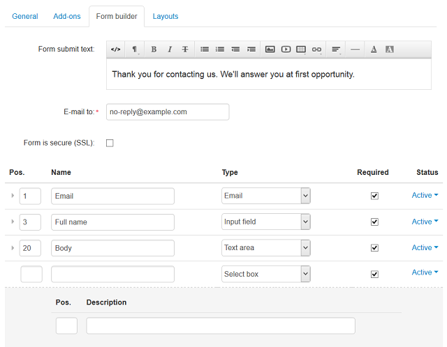
Form Builder
Note
The Form builder tab appears only if you create a form.
- Form submit text—the text that is shown to the user after the form is submitted.
- E-mail to—the email address that will receive the submitted data.
- Form is secure (SSL)—if you enable this option, the form is submitted through the secure protocol.
The following parameters apply to the fields of the form:
- Position—the position of the form field relatively to the position of the other fields of the form.
- Name—the name of the field as it appears in the form.
- Type—the type of the field. If the field type involves a selection, you can specify as many choices and alternatives as you need.
- Required—if you enable this option, users will have to fill in this field to submit the form.
- Status—the status of the field—Active or Disabled.
If the field type is Select Box, Radio Group, Multiple Check boxes, or Multiple Select box, two extra fields appear on the screen:
- Position—the position of the item relative to positions of the other items.
- Description—the content of the field.

Poll
Note
The Polls add-on is not available in the free mode. The Poll tab only appears when you create a poll.
- Poll results visible to—the types of users, who can see the poll results.
- Poll header—the header of the poll.
- Poll footer—the footer of the poll.
- Poll message—the message to be displayed on the storefront after the poll is completed.
Questions
Note
The Polls add-on is not available in the free mode. The Poll tab only appears when you create a poll.
This tab lists the questions included in the poll.
Important
If the Questions tab doesn’t appear, make sure you have clicked Create in the top right corner of the screen. You can set the Status to Disabled on the General tab while you add questions and answers to the poll.

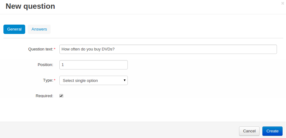
When you add or edit a question, you need to specify the following attributes:
- General
- Question text—the question itself.
- Position—the position of the question relatively to positions of the other questions in the list.
- Type—the type of the field for the answer.
- Required—if you enable this option, the question will be mandatory for the poll participants to answer.

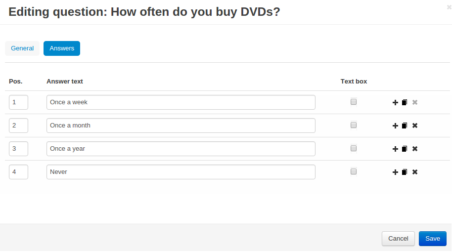
- Answers
- Position—the position of the answer relatively to positions of the other answers to the question.
- Answer text—the answer itself.
- Text box—if you enable this option, the answer will have a text box for custom answers.

Poll Statistics
Note
The Polls add-on is not available in the free mode. The Poll tab only appears when you create a poll.
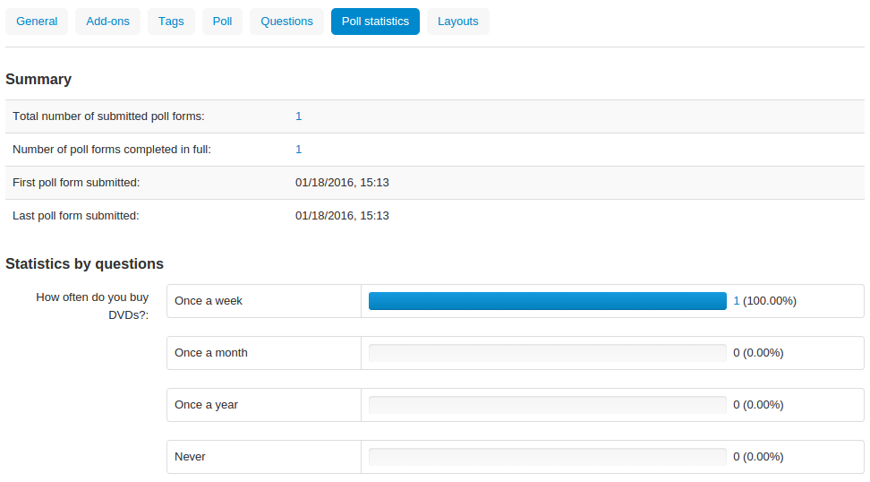
This tab contains the statistics on the submitted/completed polls and questionnaires.
Total number of poll forms submitted—the amount of polls submitted by store users.
Number of poll forms fully completed—how many polls were completed in full.
The values of these two fields are links. Click on one of the links to see the following details:
- Date—the date and time when the poll was submitted;
- User—the name of the user who submitted the poll;
- IP—the IP address of the user who submitted the poll (each user is allowed to complete a poll only once. This is controlled by the user’s IP addresses);
- Completed—the label that shows whether the poll was completed in full.
First poll form submitted—the date and time when the first poll was submitted.
Last poll form submitted—the date and time when the latest poll was submitted.
Statistics by questions—the questions of the poll, all the answers to these questions and the percentage of the answers.

Questions & Feedback
Have any questions that weren't answered here? Need help with solving a problem in your online store? Want to report a bug in our software? Find out how to contact us.