Smart Mega Menu
Overview
Every day online stores and marketplaces lose dozens of client because of uncomfortable site navigation system. Simplified interaction between the site and the user makes a positive influence on site conversion and selling rate, allows to advance the user experience, increase the scroll reach and user time. Smart Mega Menu presents new solutions for advancing the product search system and menu customization of your store/marketplace. Icons and labels makes it easier to read the information about the products. 5 new templates of vertical and horizontal menu display will perfectly fit into stores and marketplaces with a great variety of goods. Use integrated into menu system banners to promote information about sales, promo actions and special offers.
Features
- Put the labels and icons on menu and categories elements
- Add an additional content to 1st level elements of the menu
- Use 5 new options of menu display with special Smart Mega Menu block in block manager
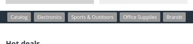
Horizontal list with scrolling:
- Compact content display with single level menu.
- Upload more information using scrolling function.
- Ability to hide/display the content scrolling button.
Horizontal list with collapsing:
- Compact content display with single level menu.
- Hide the additional paragraphs of your menu under the More ▼ button of the block.
Dropdown list by content width
Dropdown list by window width
Dropdown list in popup
- Save the page space by hiding the menu under the button with your text on it.
- Flexible settings of the element template.
- The template will automatically adapt to the mobile device by transforming into the Hamburger style menu during the page loading.
Compatibility
The add-on is compatible with CS-Cart and Multi-Vendor 4.12 and above, but only versions 4.12.x and above are supported. Minimum required PHP version is 5.6.
See more information about compatibility of our add-ons here.
Support
You are guaranteed a quality add-on supported by the future versions. If you need help, please contact us via our help desk system.
Demo
Check out the Smart Mega Menu add-on in our demo store.
Note
Every half an hour the demo store is reset to the default state.
Managing in the admin panel
Installing the add-on
Install the add-on in accordance to the instruction described in the Support Panel chapter
Menu Settings
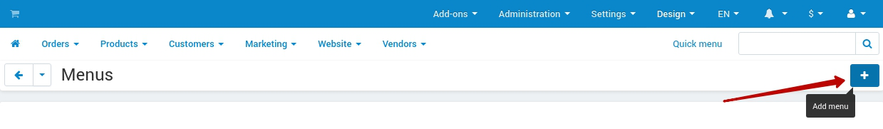
- Open Design → Menus tab on the Admin Panel
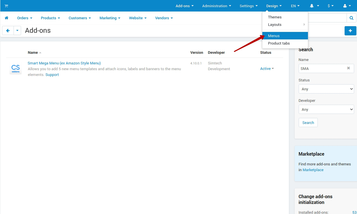
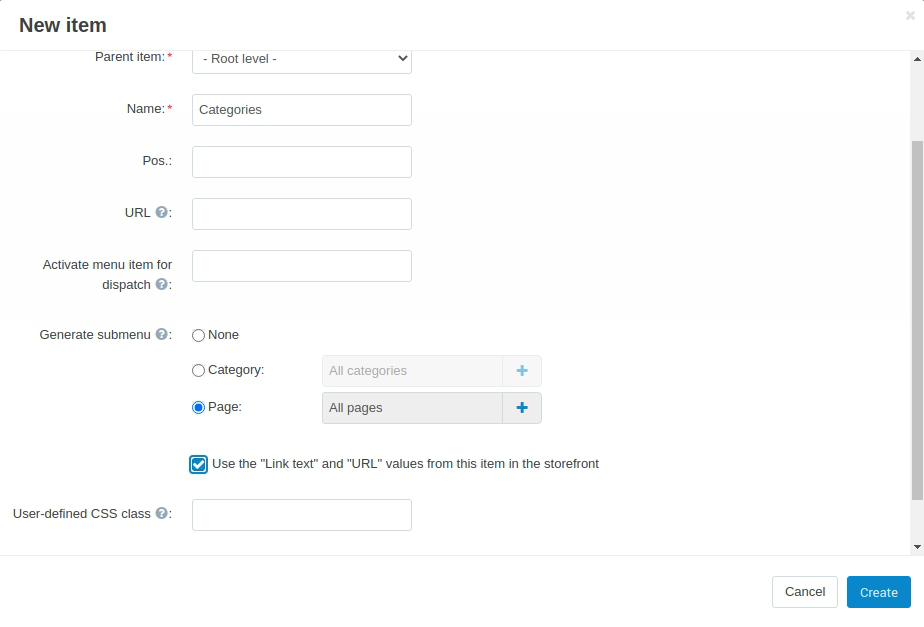
- Create new/change menu
- Add/change several elements of the mentioned menu
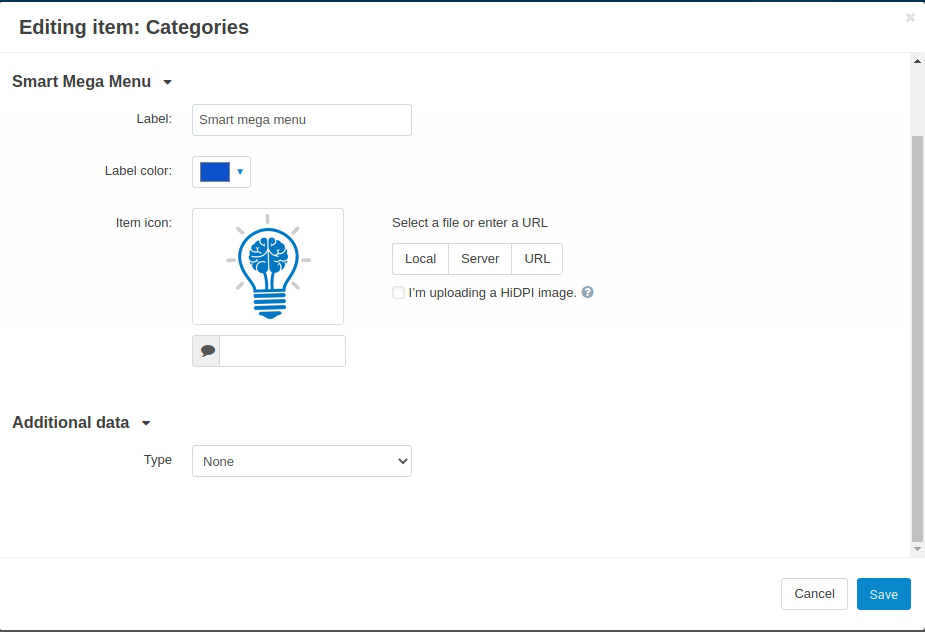
4. Configure the new settings. After the new elements are added, each of them has additional settings on Add-ons tab of the Editing item modal window:
- Add label
- Add icon
- Add additional content (banner or block)
Note
Make sure that Use the “Link text” and “URL” values from this item in the storefront is selected to synchronize the settings of the selected pages with the menu.
Categoty Settings
- Open Products → Categories page using secondary menu of an Admin Panel
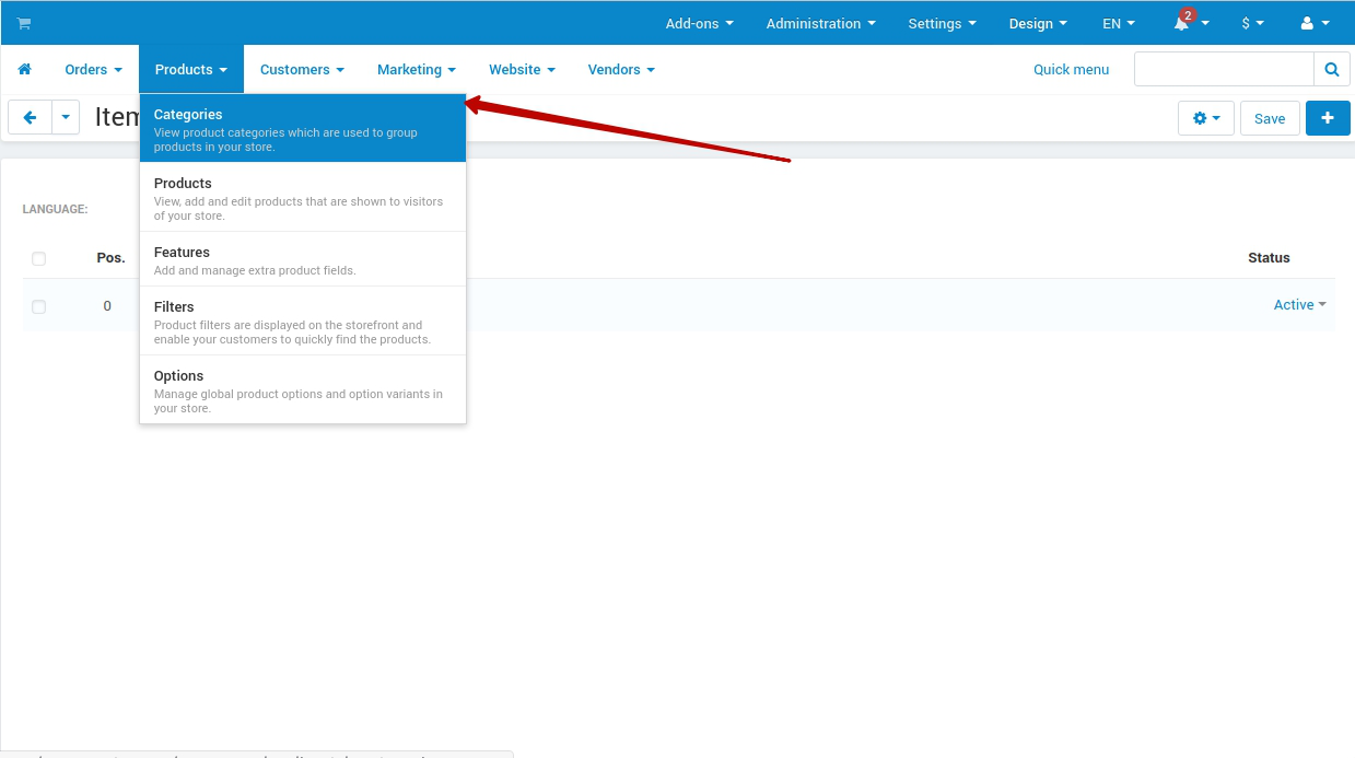
Select any category from the list
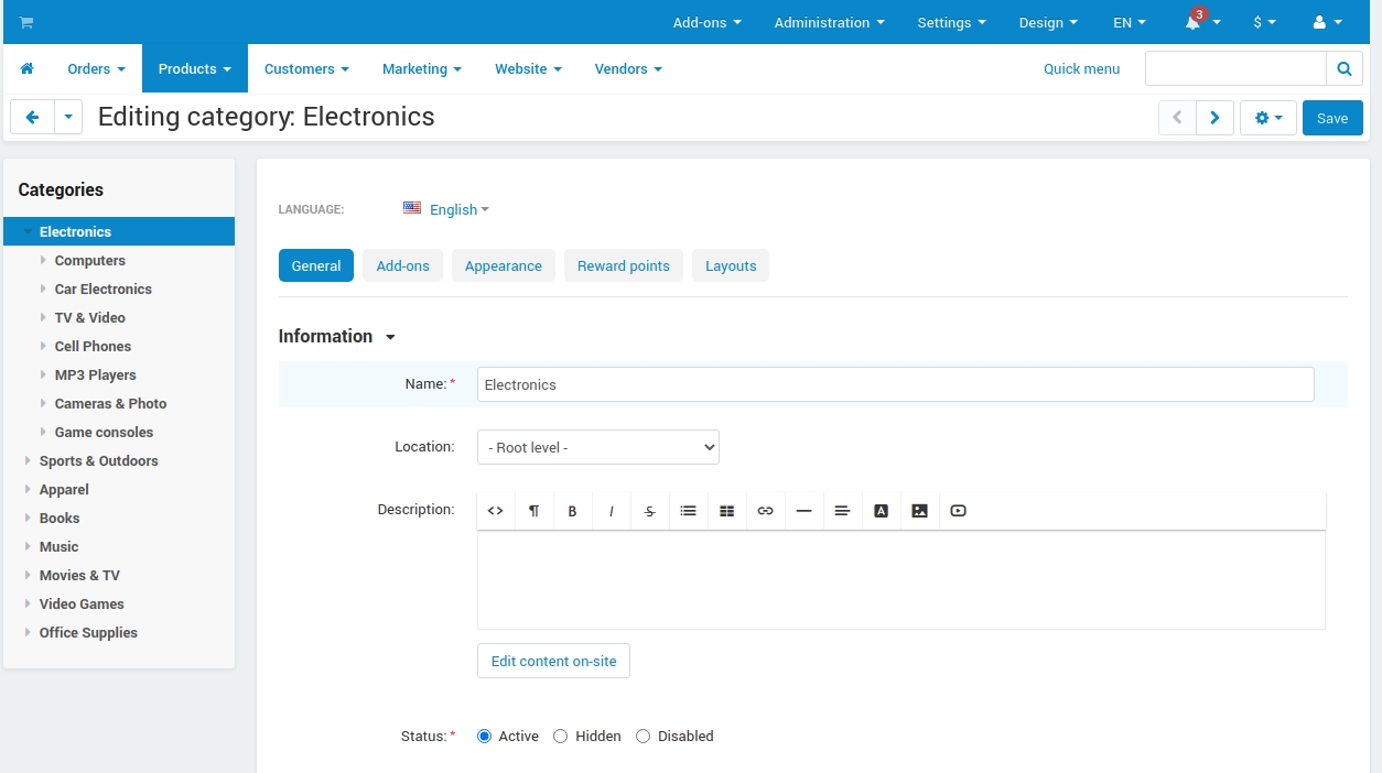
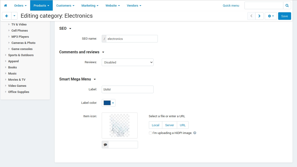
Open the Add-ons tab
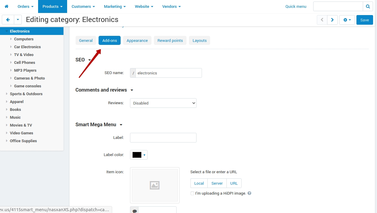
Configure the new settings
- Label
- Label color
- Item color
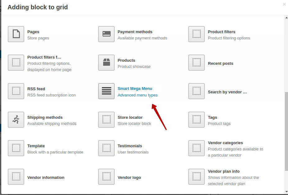
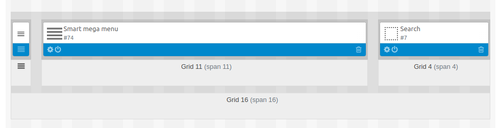
Add and Set Up a Block
- Open Design → Layouts page using the main menu
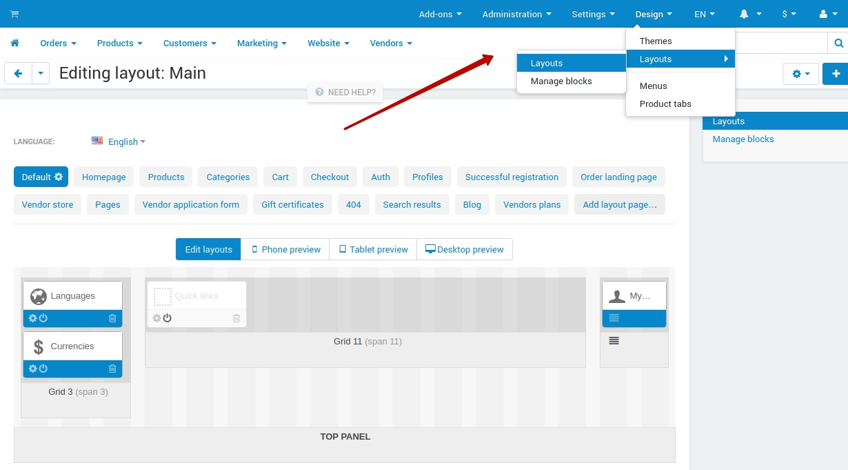
- Select Default in layout pages list
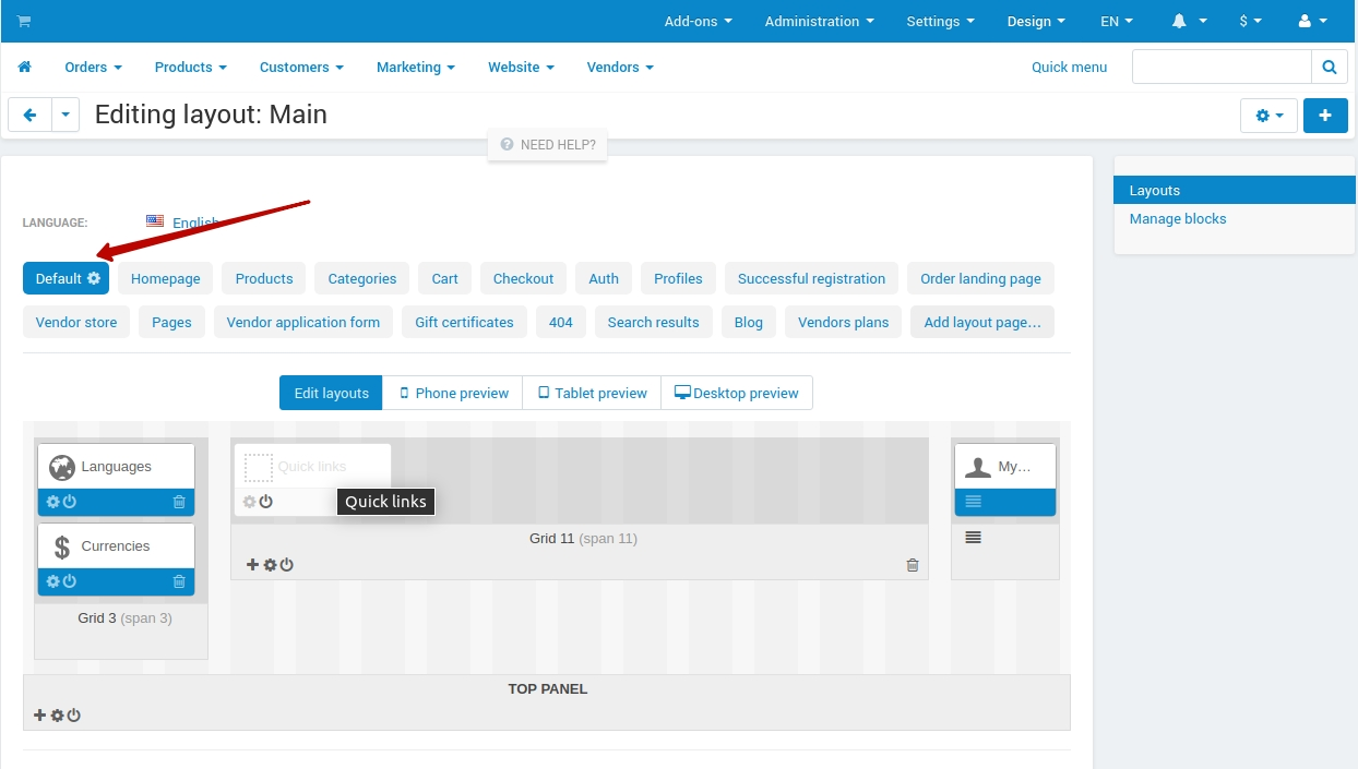
- Add new section to TOP PANEL or HEADER field
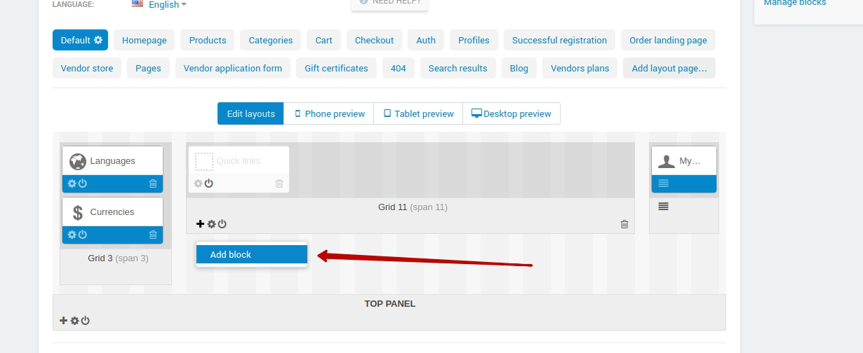
Add block Smart mega menu (Create New Block tab) to the new Section
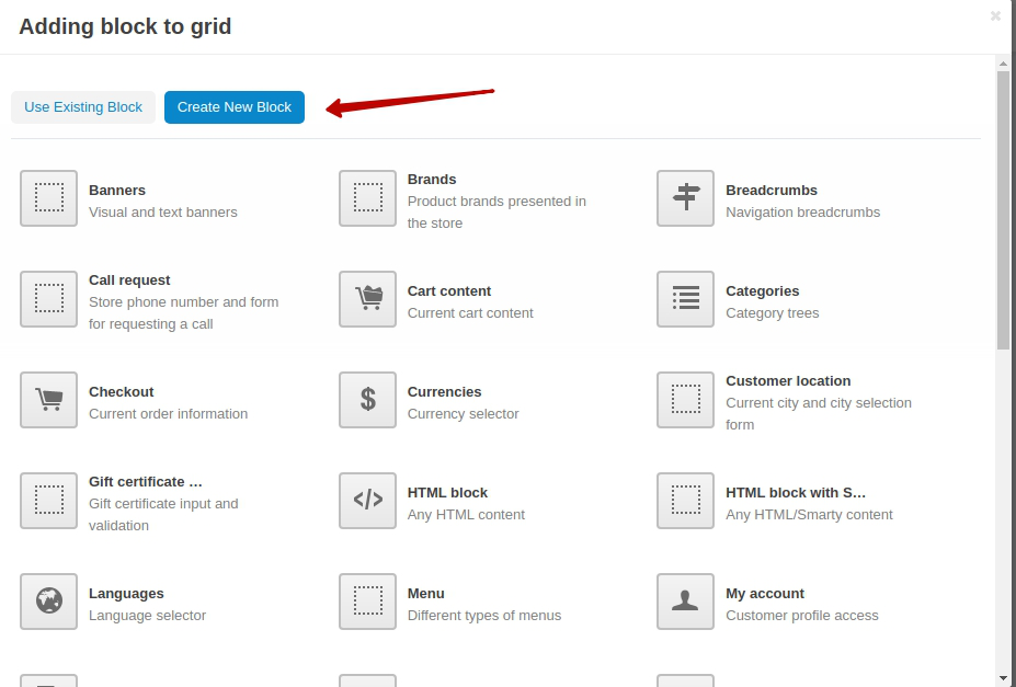
- Insert the block name and chose the necessary template
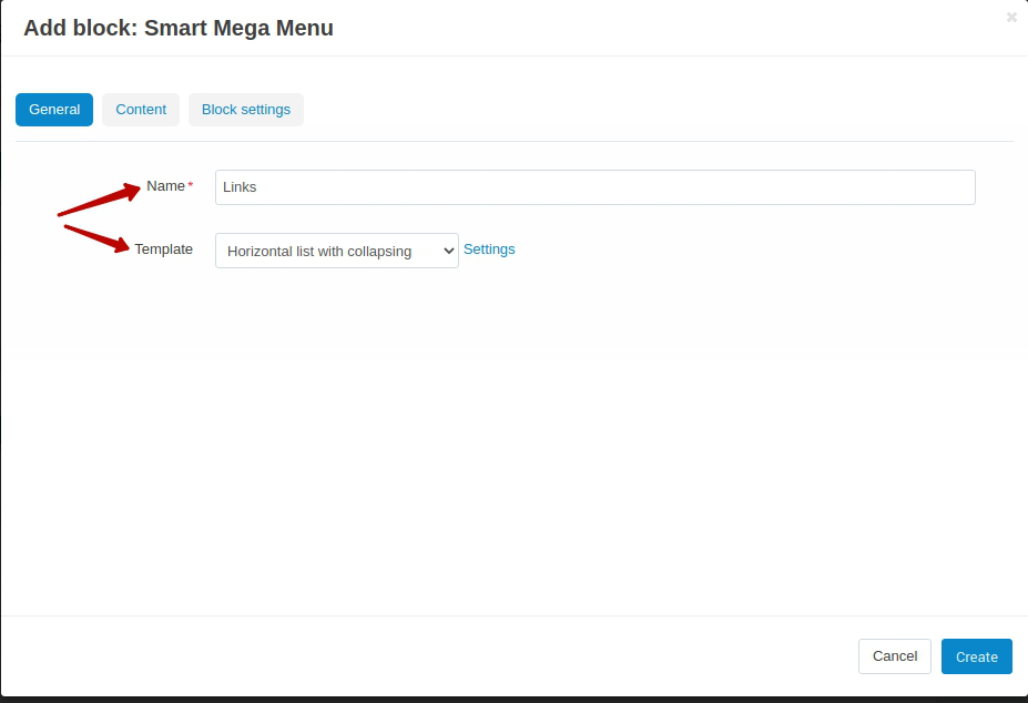
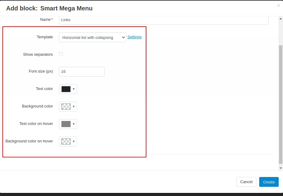
- Press settings button next to Template selection field on General tab and configure the appeared settings
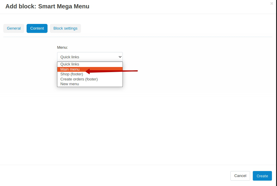
- Select previously configured menu on a Content tab
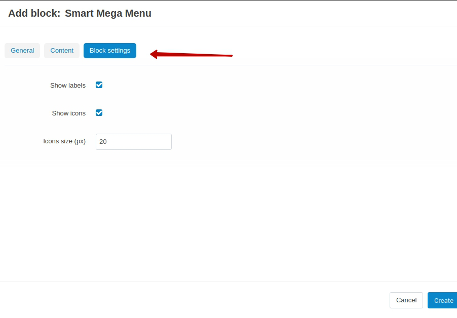
- Configure the settings on a Block Setting tab
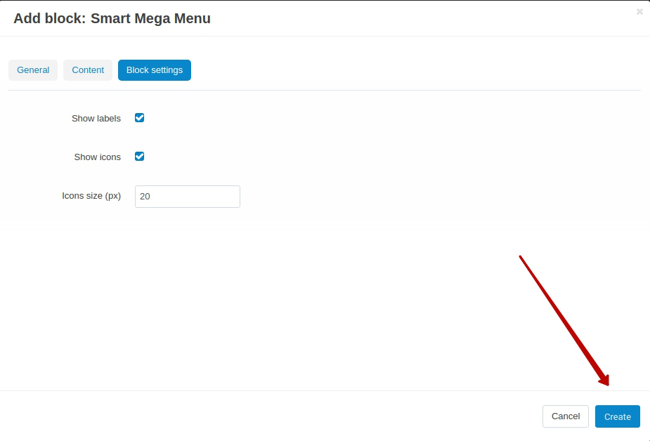
- Press Create button at the bottom of the modal window
Location With Other Blocks
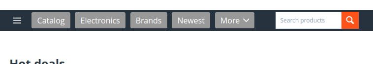
When using the “Horizontal list with collapsing” and “Horizontal list with scrolling” templates, the menu completely fills the selected space and can hide near elements. This example shows the using of a block with an element of the Hamburger Menu add-on:
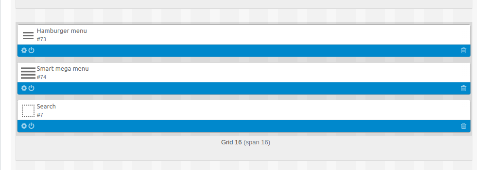
To avoid overlapping near elements, all elements in the grid should be placed in their own sections with the specific dimensions:
You can add a custom class “sd-smart-menu-row-center” to the main section, for vertically center the menu items and its near elements.
Block Settings
General Settings
- Show labels setting allows displaying/hiding the labels weather they are set up or not.
- Show icons setting allows displaying/hiding the icons weather they are set up or not.
- Icon size (px) sets the size of the icon
Template Settings
Template: Horizontal list with scrolling
Settings Description Show navigation Show/hide the blockscrolling button Show separators Show/hide menu items separators Font size (px) Menu items font size Text color Menu items text color Background color Menu items’ background color Text color on hover Menu items text color on hover Background color on hover Menu items background color on hover Template: Horizontal list with collapsing
Setting Description Show navigation Show/hide the blockscrolling button Show separators Show/hide menu items separators Font size (px) Menu items font size Text color Menu items text color Background color Menu items’ background color Text color on hover Menu items text color on hover Background color on hover Menu items background color on hover Template: Dropdown list by content width
Settings Description Show banner Show/hide additional content Background color for primary panel 1st level menu background color Background color for secondary panel Secondary panel background color Number of columns Secondary level columns amount (depends on the Orientation for level 2 setting) Orientation for level 2 Orientation of the secondary level
- Vertical. The secondary level will occupy the full width of the screen and the level 3 panel will be displayed as columns (the amount of columns depends on Number of columns setting)
- Horizontal. The secondary level will be shown as columns. The amount of the columns is mentioned in Number of columns setting.
Button Font size (px) Button font size Text color Button text color Background color Button background color Background color in active state Color of the active button background Text color in active state Color of the active button text 1 level Font size (px) 1st level text font size Text color First level text color Text color in active state 1st level active state text color Background color in active state 1st level active state background color 2 level Font size (px) 2nd level items’ font size Text color 2nd level items’ text color Text color on hover 2nd level items’ text color on hover 3 level Font size (px) 3rd level items’ font size Text color 3rd level items’ text color Text color on hover 3rd level items’ text color on hover Template: Dropdown list by window width
Settings Description Show banner Show/hide additional content Background color for primary panel 1st level menu background color Background color for secondary panel Secondary panel background color Number of columns Secondary level columns amount (depends on the Orientation for level 2 setting) Orientation for level 2 Orientation of the secondary level
- Vertical. The secondary level will occupy the full width of the screen and the level 3 panel will be displayed as columns (the amount of columns depends on Number of columns setting)
- Horizontal. The secondary level will be shown as columns. The amount of the columns is mentioned in Number of columns setting.
Button Font size (px) Button font size Text color Button text color Background color Button background color Background color in active state Color of the active button background Text color in active state Color of the active button text 1 level Font size (px) 1st level text font size Text color First level text color Text color in active state 1st level active state text color Background color in active state 1st level active state background color 2 level Font size (px) 2nd level items’ font size Text color 2nd level items’ text color Text color on hover 2nd level items’ text color on hover 3 level Font size (px) 3rd level items’ font size Text color 3rd level items’ text color Text color on hover 3rd level items’ text color on hover Template: Dropdown list in popup
Settings Description Show banner Show/hide additional content Background color for primary panel 1st level menu background color Background color for secondary panel Secondary panel background color Number of columns Secondary level columns amount (depends on the Orientation for level 2 setting) Orientation for level 2 Orientation of the secondary level
- Vertical. The secondary level will occupy the full width of the screen and the level 3 panel will be displayed as columns (the amount of columns depends on Number of columns setting)
- Horizontal. The secondary level will be shown as columns. The amount of the columns is mentioned in Number of columns setting.
Button Font size (px) Button font size Text color Button text color Background color Button background color Background color in active state Color of the active button background Text color in active state Color of the active button text 1 level Font size (px) 1st level text font size Text color First level text color Text color in active state 1st level active state text color Background color in active state 1st level active state background color 2 level Font size (px) 2nd level items’ font size Text color 2nd level items’ text color Text color on hover 2nd level items’ text color on hover 3 level Font size (px) 3rd level items’ font size Text color 3rd level items’ text color Text color on hover 3rd level items’ text color on hover
Questions & Feedback
Have any questions that weren't answered here? Need help with solving a problem in your online store? Want to report a bug in our software? Find out how to contact us.