Hamburger Menu
Overview
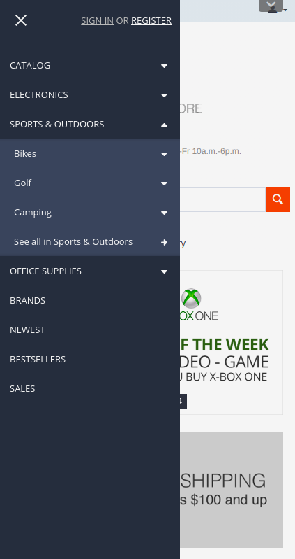
The Hamburger Menu add-on allows you to create a little three-lined button that hides the traditional menu. Clicking the button opens the site navigation, which can contain links to pages all over the website.
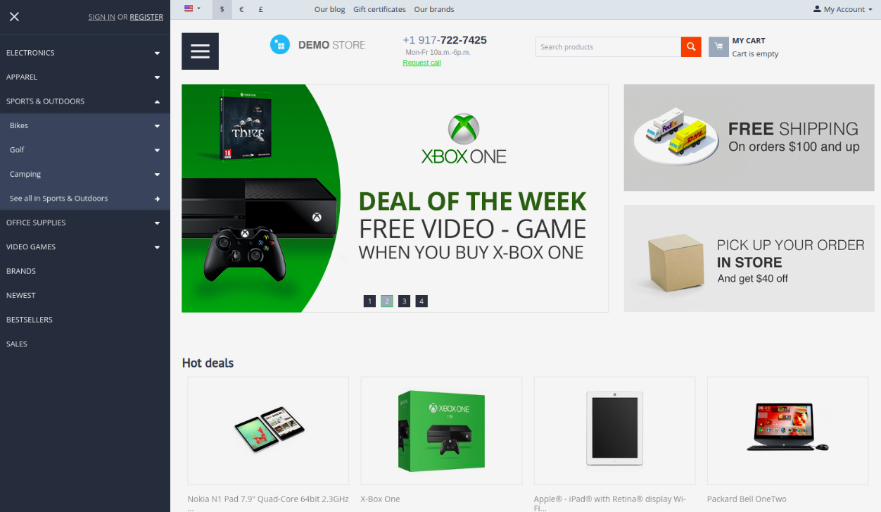
It’s a great solution to handle navigation on smaller screens. It keeps the screen clean and saves valuable space.
The look and feel of the menu is customizable. You can change the colors for the button and menu background, pick colors for the first, second and third level items.
The content of the hamburger menu may vary:
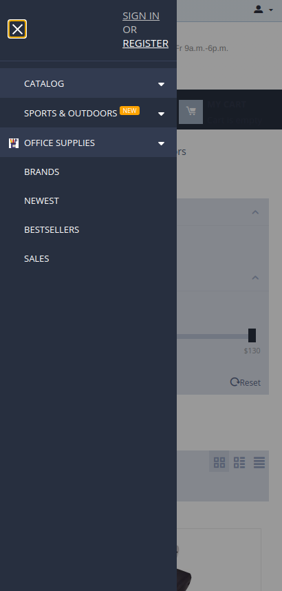
- Quick links

- Main menu
- Footer items (e.g. blog, reviews, about us, sitemap)
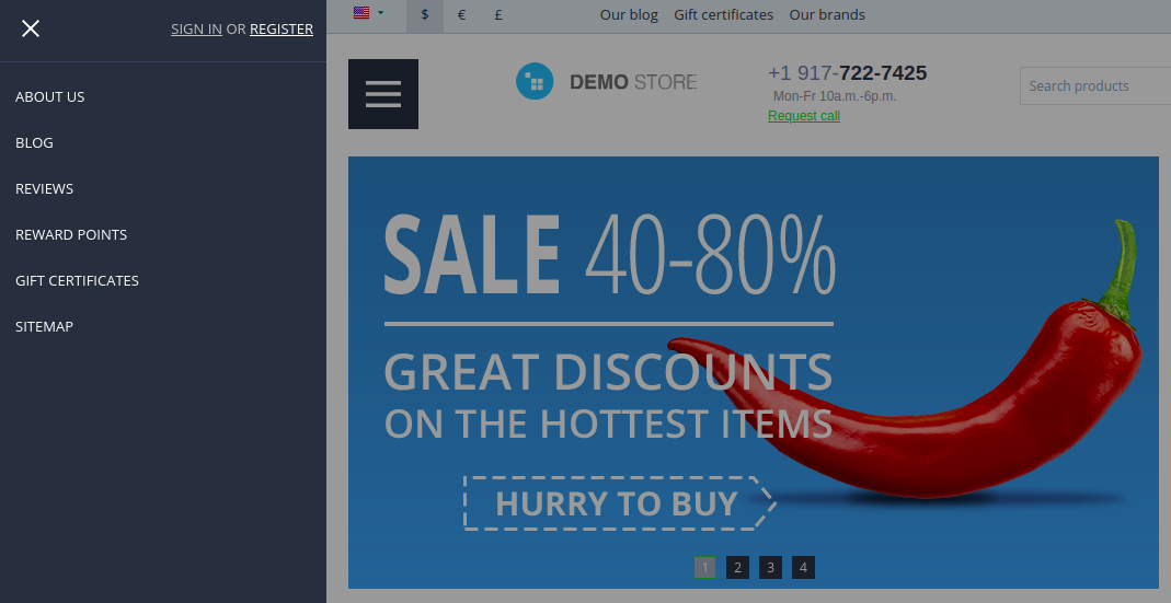
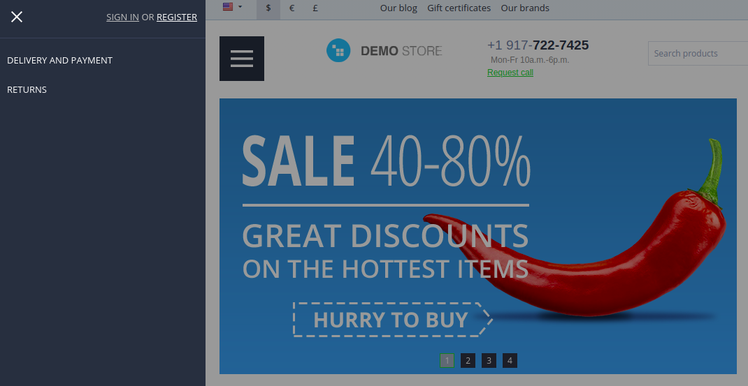
- Footer items of create orders (e.g. delivery and payment, returns)
Key features
- The menu is opened by swiping from the edge of the screen (on mobile and tablet) or by clicking on the three-line button.
- The menu can be closed by swiping from any place on the screen, by clicking on the overlay or on the Close button. Switching happens when the swipe length is more than half the panel width.
- The hamburger menu sidebar contains an account menu.
- Ability to create a bar that includes a menu, a search field, and a cart.
- The add-on is compatible with Amazon Style Menu and Smart Mega Menu add-ons (it supports icons and labels).
Note
Icons and labels are available only if you have Amazon Style Menu and/or Smart Mega Menu add-ons are installed and active. The Hamburger Menu add-on doesn’t provide this functionality by default.
Compatibility
The add-on is compatible with CS-Cart and Multi-Vendor 4.12 and above. Minimum required PHP version is 5.6.
See more information about compatibility of our add-ons here.
Support
You are guaranteed a quality add-on supported by future versions. If you need help, please contact us via our help desk system.
Demo
Check out the look and feel of the Hamburger menu add-on in our demo store.
Note
Every half an hour the demo store is reset to the default state.
Managing in the admin panel
Installing the add-on
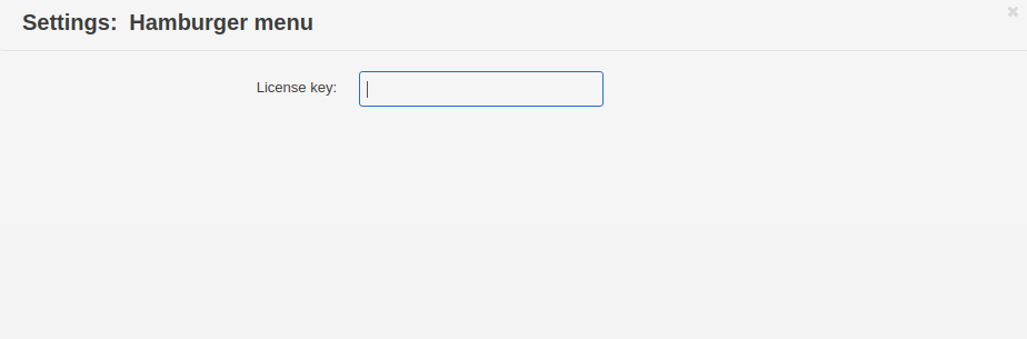
Install the Hamburger menu add-on on the add-ons list page (Add-ons → Manage add-ons). Click the + button in the top right corner, select an archive, and click Upload & install. You can now find the installed add-on in the list of installed add-ons, just make sure it is set to Active and fill in the License key field.
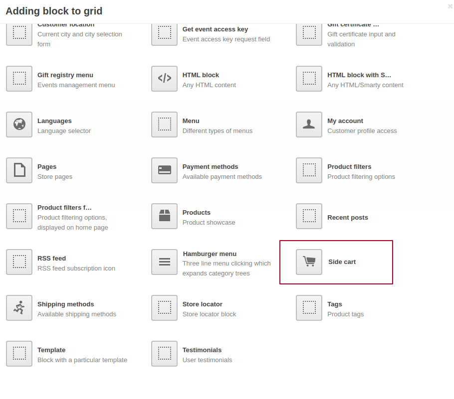
Creating a hamburger menu
To create a separate hamburger menu, follow the instructions:
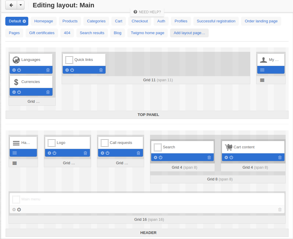
- Navigate to Design - Layouts.
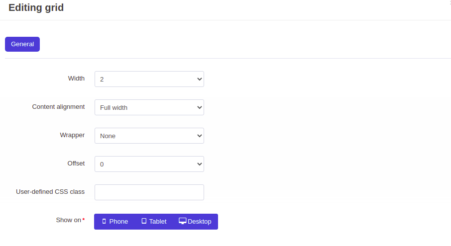
- In the Header container, add a new grid, and set it up.
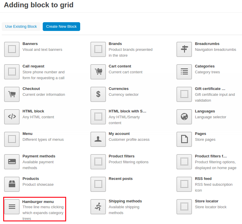
- Add a new Hamburger menu block to the created grid.
- In the General tab, give a name for the block. Then click Settings and specify the maximum number of second and third level elements that will be shown in the menu and Show “See all” button option can be selected.
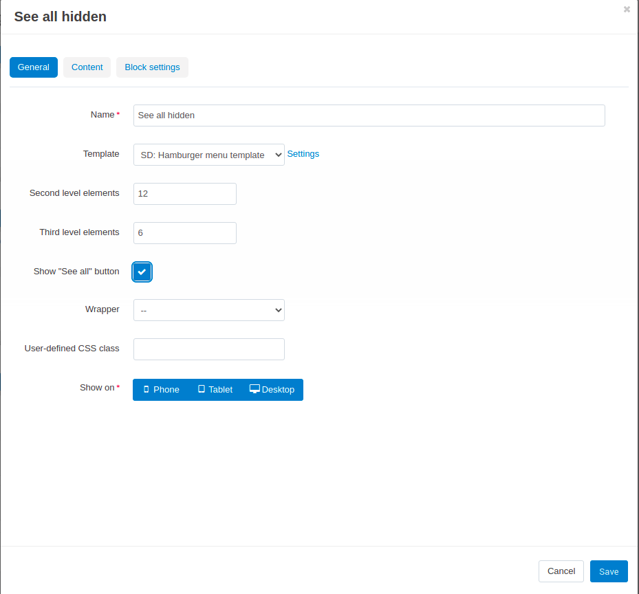
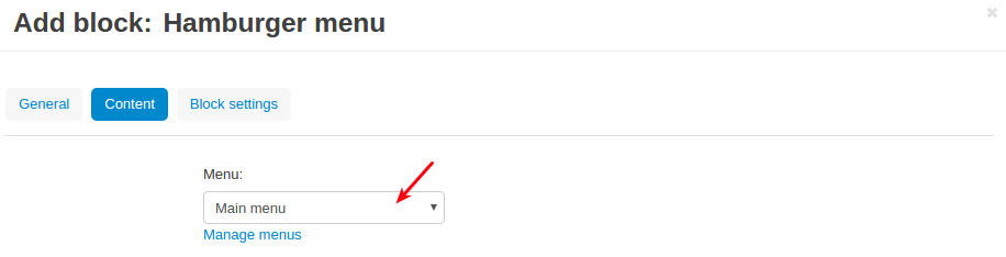
- In the Content tab, select what content you’d like to show: quick links, main menu, shop (footer), create orders (footer).
Note
Click Manage menus if you want to add new links or remove some existing ones. You will be redirected to the Design - Menus page. There you can change the filling of the menu. Refer to CS-Cart user guide for more information.
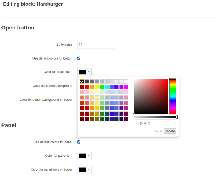
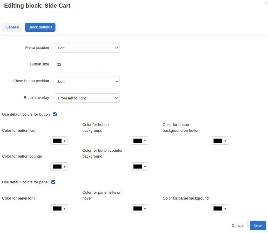
- In the Block setting tab, configure the look and feel of the menu.
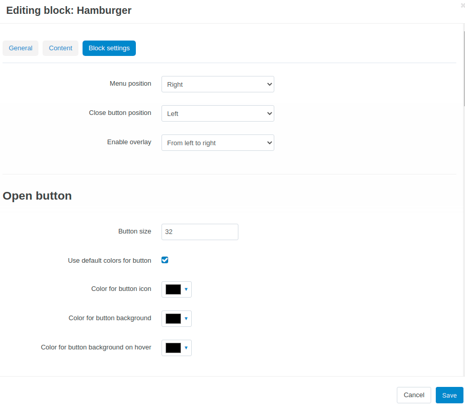
Menu position—Choose where the menu will appear: from the left side or the right side.
Button size—Define a suitable size for the menu in pixels.
Close button position—Choose a position for the close button in the menu: left or right.
Enable overlay—Choose a direction for the overlay effect: from left to right or from right to left, so the page will be darkened with the focus on the menu. Select None if you don’t want to show an overlay when the menu opens.
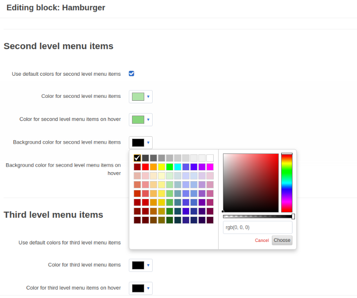
Configure the rest of the settings by picking desired colors for the button background, menu background, etc, or use default colors.
- Click Create or Save.
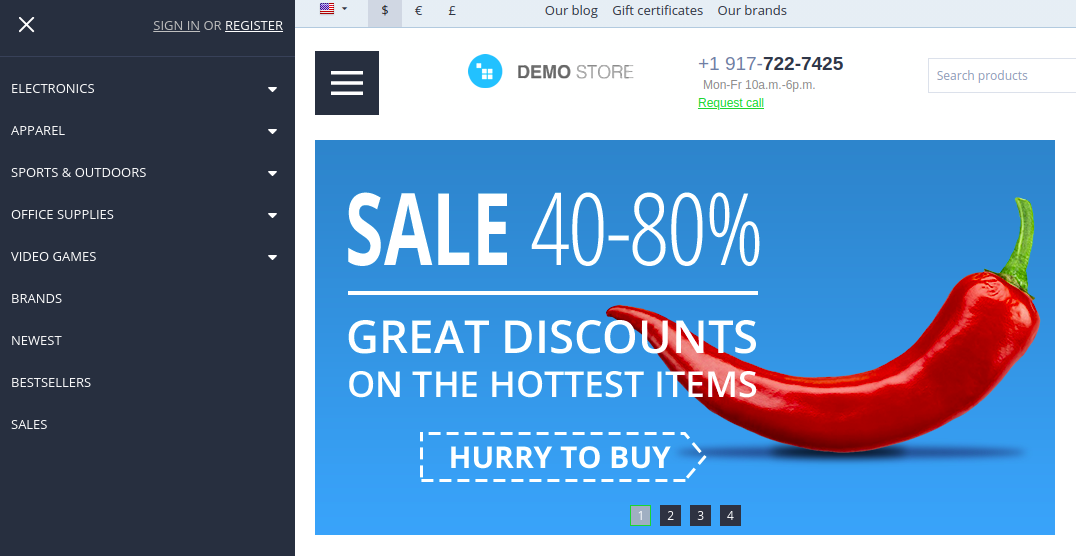
- Change the width of the other grids so that in total they take up 14 columns (as the hamburger menu takes 2 columns). Optionally, you can hide the Main menu.
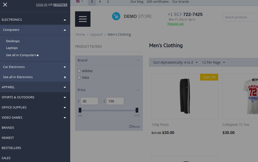
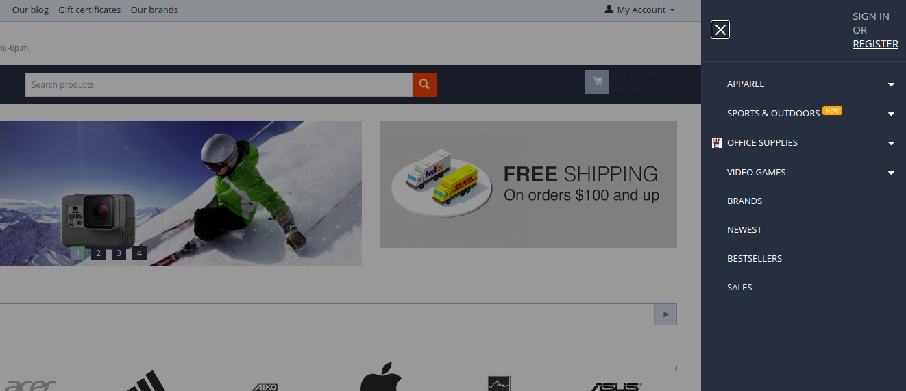
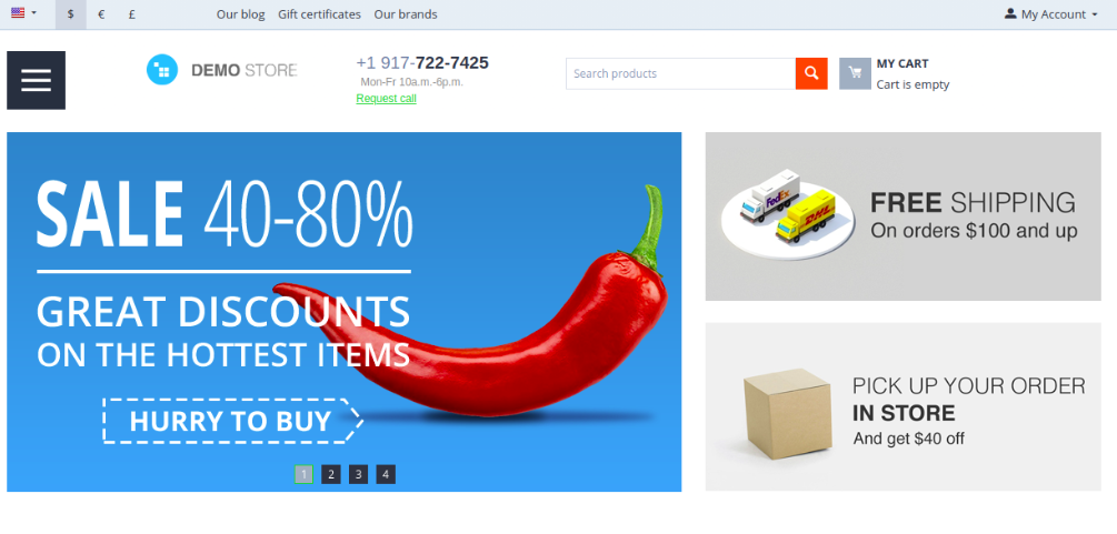
Here’s the result:
Creating a panel with a hamburger menu, a search block, and a cart button.
- Create a grid in the header with a CSS class
hamburger-grid.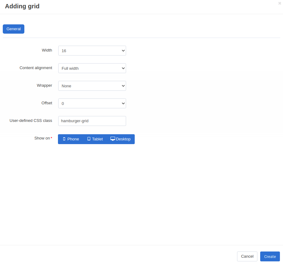
- Add a Hamburger Menu block, a Search and, a Cart content block to the created grid.
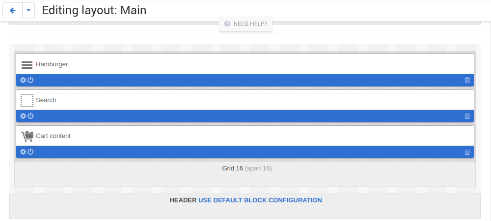
- Add a
top-searchclass for the Search block.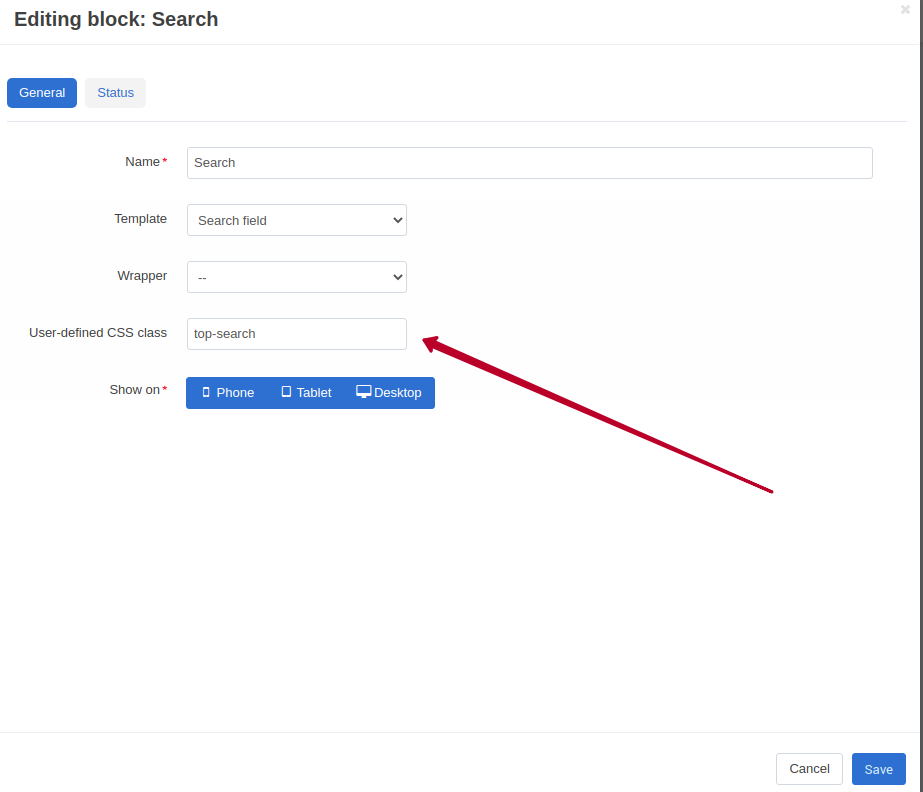
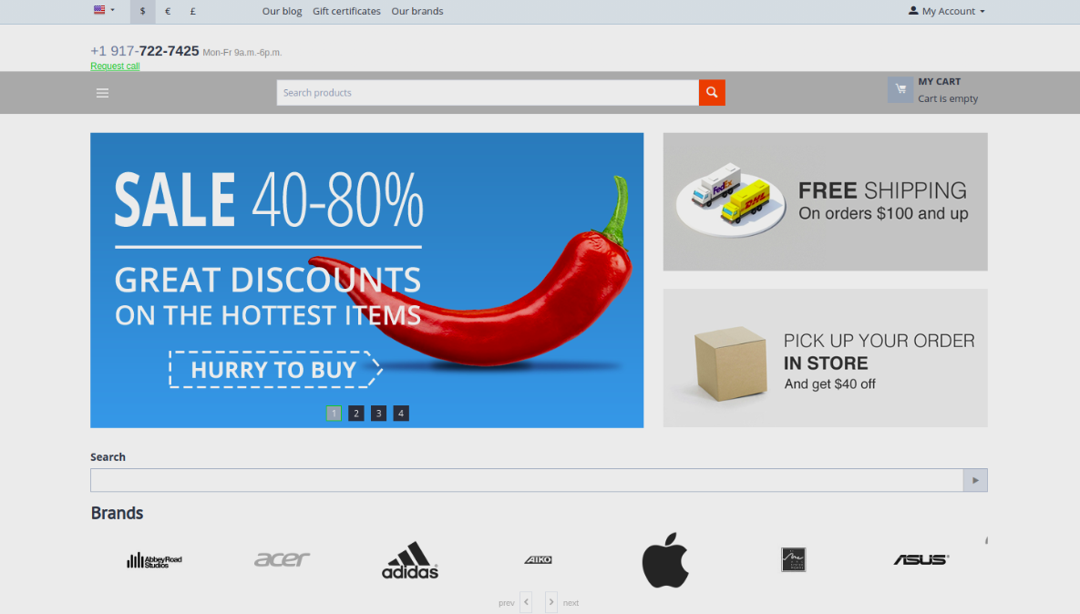
And here is how it looks like!
By default, the color of the menu is determined by the theme settings for the menu.
If you want to change its color, navigate to the Theme Editor and change it.
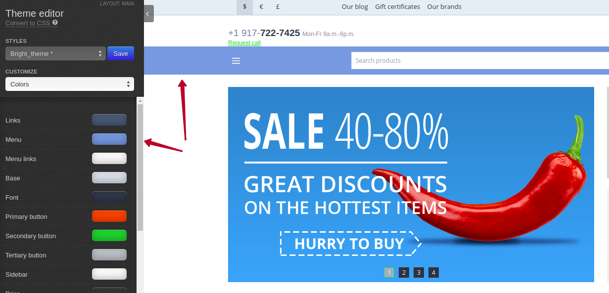
For more information on Theme Editor, refer to CS-Cart documentation.
Note
The Hamburger Menu add-on supports its own scrollbar styles for Chrome. Other browsers do not support such styling, so a default scrollbar will be displayed.
Adding a Cart button with a side panel
The add-on allows using its own cart button with the nice-looking side panel.
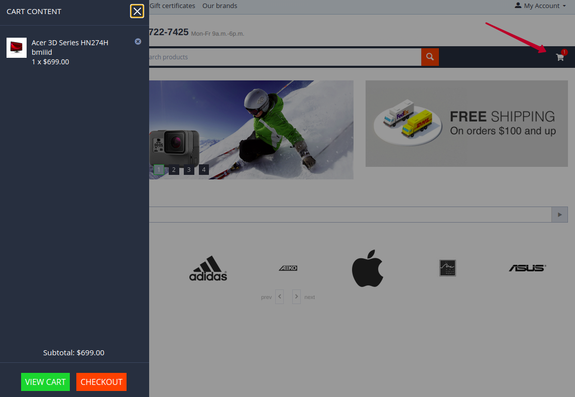
Just add the Side cart block to the layout of the page instead of the regular Cart content block.
Settings available for this block are the same as for the Hamburger Menu block. Change the look and feel of the button to suit your needs.
FAQ
Is it possible to change the Register or Sign in font size?
By default, the font size is 15px. You can change it with the help of custom CSS for selector .account-menu .account-menu__link {}.
Questions & Feedback
Have any questions that weren't answered here? Need help with solving a problem in your online store? Want to report a bug in our software? Find out how to contact us.