Mobile Layouts
Overview
The Mobile Layouts add-on is a super useful extension that allows you to show different layouts on desktop, mobile, and tablet devices. Unlike desktop versions, mobile screens can fit less blocks, so it may come in handy to customize the layout for each device to ensure your visitors get the best viewing experience no matter what device they use.
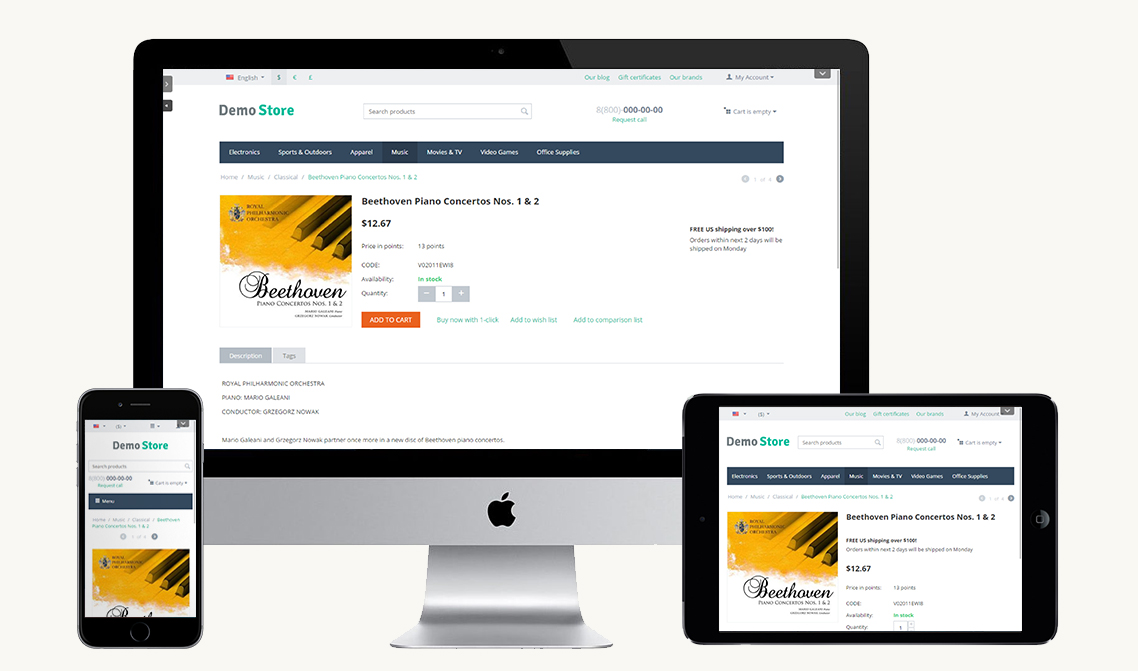
Often, a site designed for desktop has larger images and more information (images, banners, blocks, etc.). On mobile phones the page layouts are overwhelming when showing all the content that a user interacts with from the full-site. Besides, if you display all of the desktop content on a small device, it can become difficult for visitors to navigate. A desktop site may also contain additional information that might not be applicable to visitors using a mobile device.
This being said, the importance of creating mobile-friendly page layouts becomes obvious.
Learn how to install the add-on, configure settings, set up layouts, and more by following quick and easy steps below.
Compatibility
The add-on is compatible with CS-Cart and Multi-Vendor 4.11 and above, but only versions 4.12.x and above are supported. Minimum required PHP version is 5.6.
See more information about compatibility of our add-ons here.
Support
You are guaranteed a quality add-on supported by the future versions. If you need help, please contact us via our help desk system.
Demo
Check out the Mobile Layouts add-on in our demo store.
Note
Every half an hour the demo store is reset to the default state.
Managing in the admin panel
Installing the add-on
Install the Mobile Layouts add-on on the add-ons list page (“Add-ons” → ”Manage add-ons”). Click the + button in the top right corner, select an archive and click Upload & install. You can now find the installed add-on in the list of installed add-ons, just make sure it is set to Active.

Setting up the add-on
There are three available settings for this add-on. You need to select desired layouts to display on different devices:
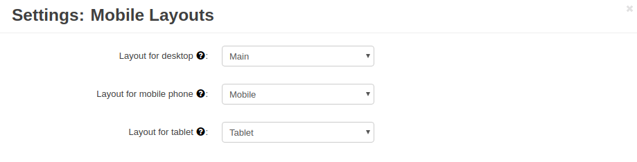
- Layout for desktop—Select a desired layout to display on the desktop version. If “None” is selected, the default layout will be used.
- Layout for mobile phone—Select a desired layout to display on mobile phones. If “None” is selected, the default layout will be used.
- Layout for tablet—Select a desired layout to display on tablets. If “None” is selected, the default layout will be used.
Note
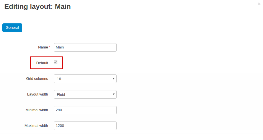
Default layout is the one that has the Default checkbox selected.
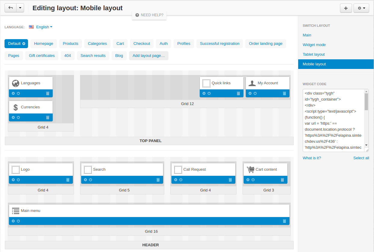
Creating a layout
To create a new mobile layout for a phone or tablet, first of all you’ll need to review the content on the existing site and determine which items are essential for the mobile device user experience. Keeping in mind that smartphone / tablet visitors are often on the go and are viewing the content on a smaller screen, it is important to simplify the design and only display content that is useful and easy to interact with on a touch screen.
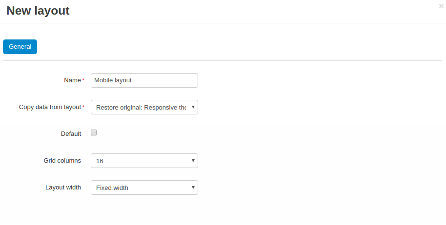
To manage layouts, navigate to Design - Layouts.
Click the + button in the top right to create a new layout.
Enter all the necessary information and click Create.
You can now set up the layout up to your needs by changing the position of blocks, resizing or removing blocks, and so on.
To learn more about layouts, you may want to have a look at CS-Cart Documentation .
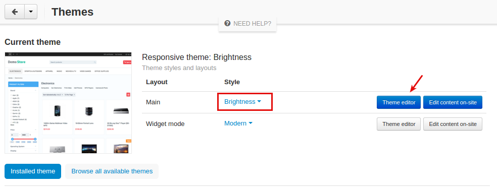
How do I add different logos for different layouts?
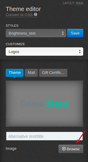
If you want to add different logos for different layouts, do so by going to Design -> Themes.
Choose the layout you want to change the logo for and click Theme editor.
Choose Logos to customize and click Save.
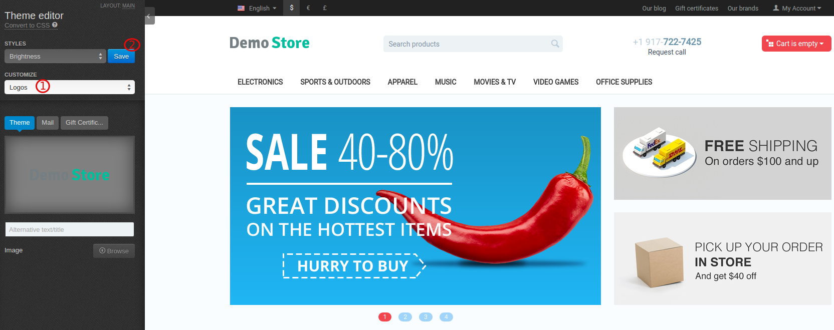
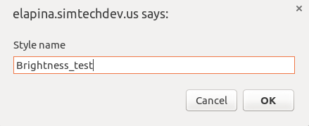
Once you’ve clicked Save the style you are editing will be cloned as you can not modify the existing style right away. You will be asked to enter a name for the style:
After that you can upload a new logo by clicking Browse.
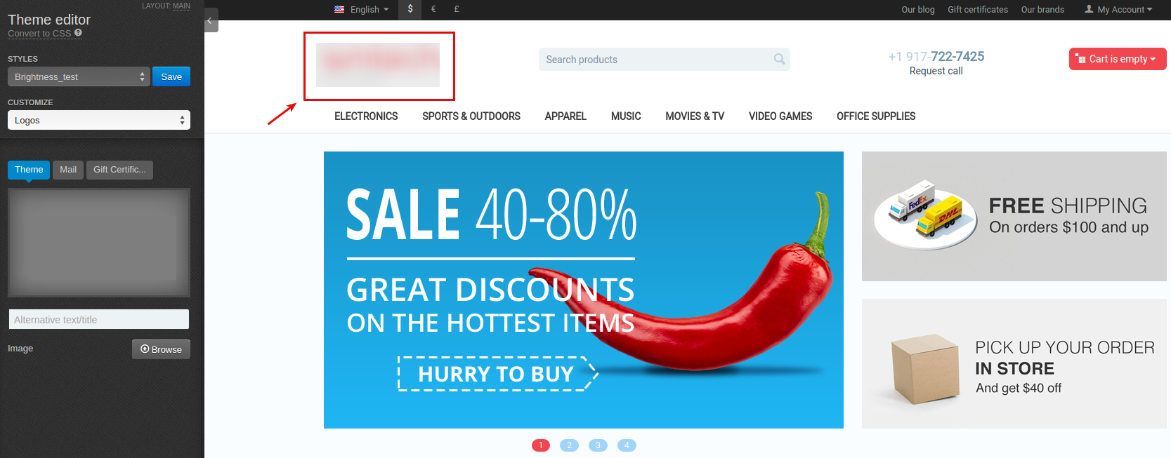
The logo will appear in the layout.
Questions & Feedback
Have any questions that weren't answered here? Need help with solving a problem in your online store? Want to report a bug in our software? Find out how to contact us.